Rezerv is a business management platform designed for service-based organisations such as fitness and wellness providers. Rezerv needed an events/workshops module to cater to different businesses needs.
Product Design (SaaS)

Project Overview
Client: Rezerv, a startup that serves as a booking and operations platform
Feature: Events/Workshops (Clients' feature request)
Industry: SaaS for fitness business, B2B & B2C
Timeline: 3 months (7 Feb 2023 - 6 May 2023)
My Role: Product Designer (Project Lead, End-to-End, UX-Focused, with UI Collaboration)
Led and owned the design of Rezerv’s Events/Workshops module from discovery to launch across B2B & B2C platforms. Drove research, MVP scoping, interaction design, and usability testing while collaborating with a UI designer on final visual execution and design system alignment.
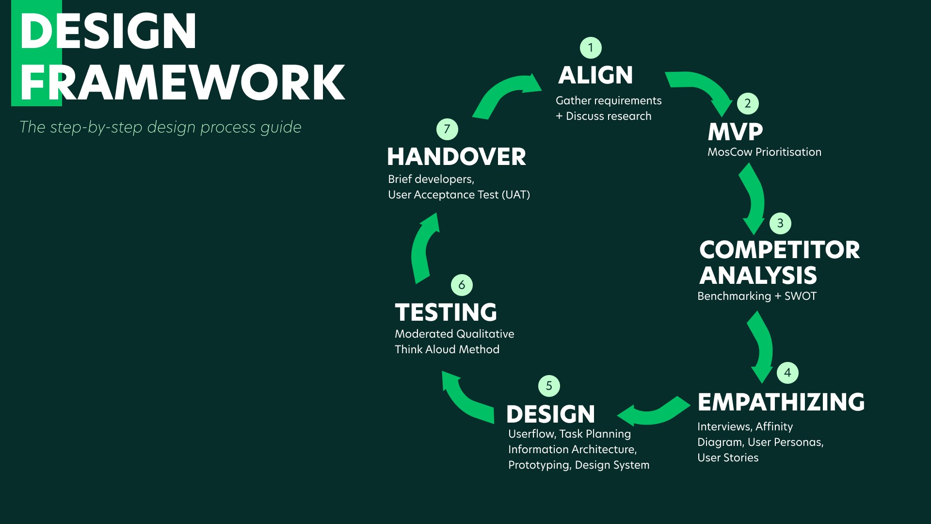
My Process
This is the design framework I came up with and have been using for subsequent projects. This allow me to work systematically with the developers, product managers and other stakeholders.
Align with Stakeholders
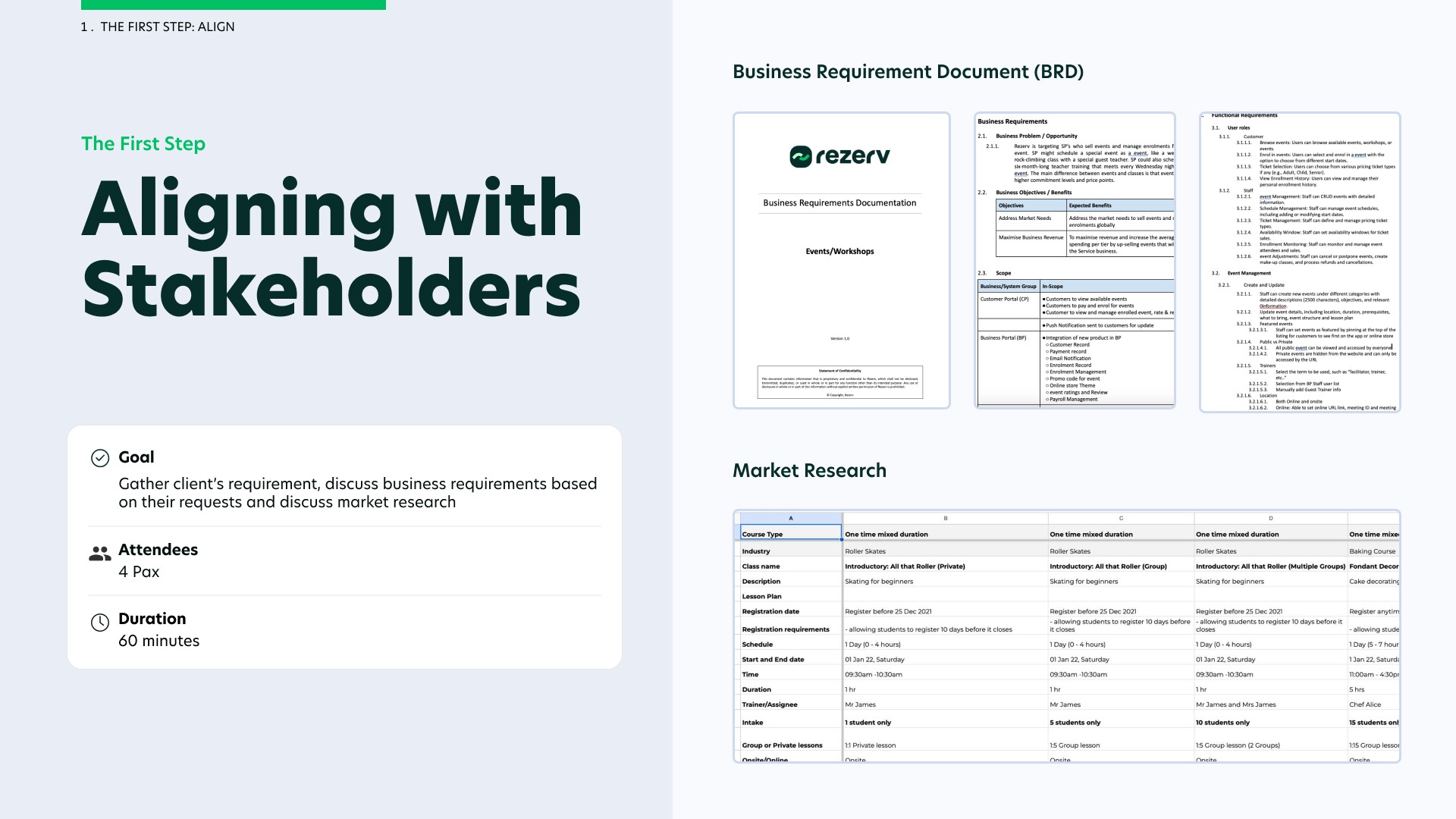
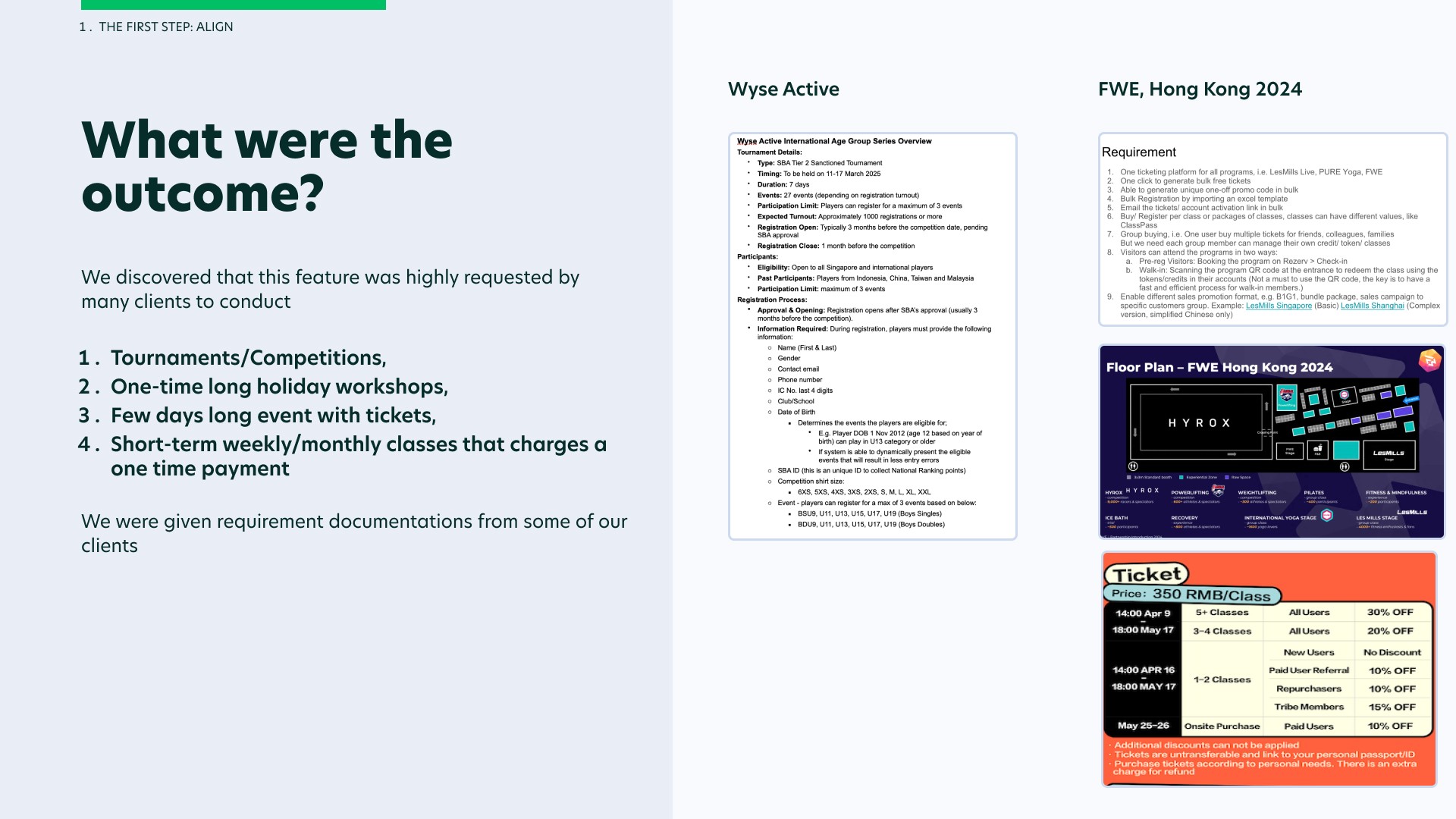
Firstly I began mapping out business objectives with our stakeholders. Our stakeholders comprise of the head of customer success, Rezerv's co-founders and my product manager.
When a fitness business subscribe to Rezerv, they are entitled to a WhatsApp group for the first month with my customer success team, where they can voice out their concerns and any feedbacks they have about the features they use. This is where the head of customer success would gather clients' concerns and requirements and would share these valuable insights with the team.
I would conduct market research to understand how fitness businesses run their events and workshops and present them to my stakeholders. This would allow us to formalise a Business Requirements Document (BRD).
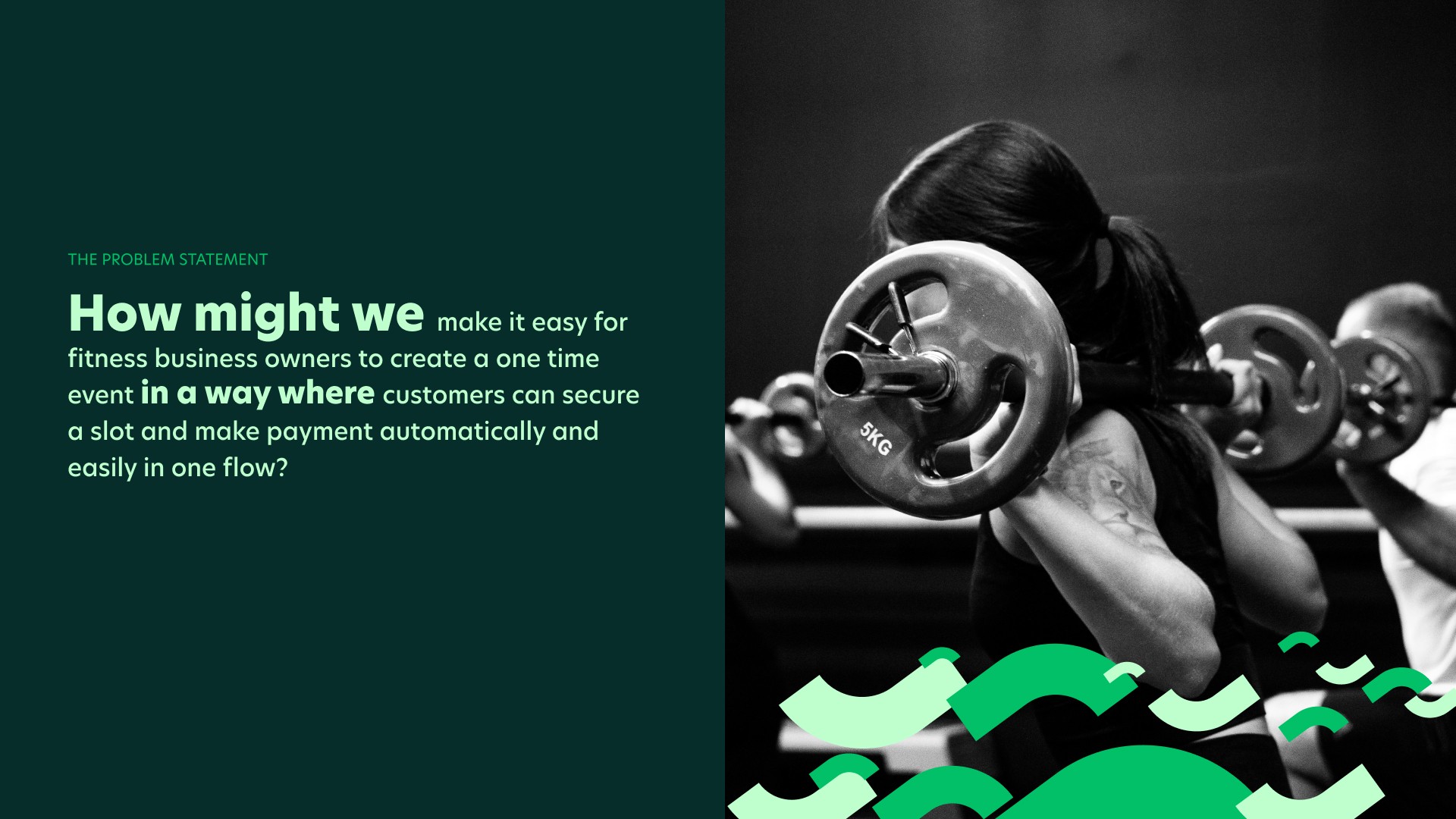
The Problem Statement
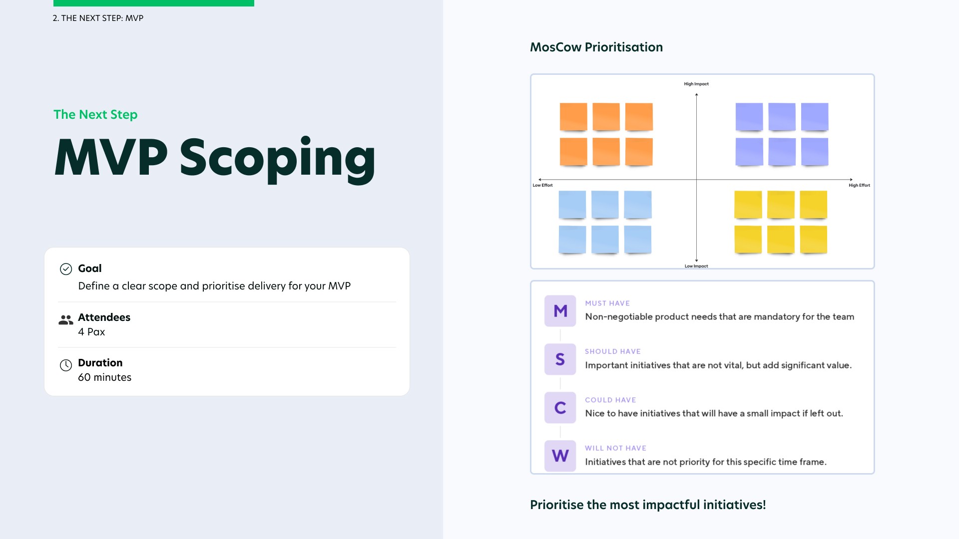
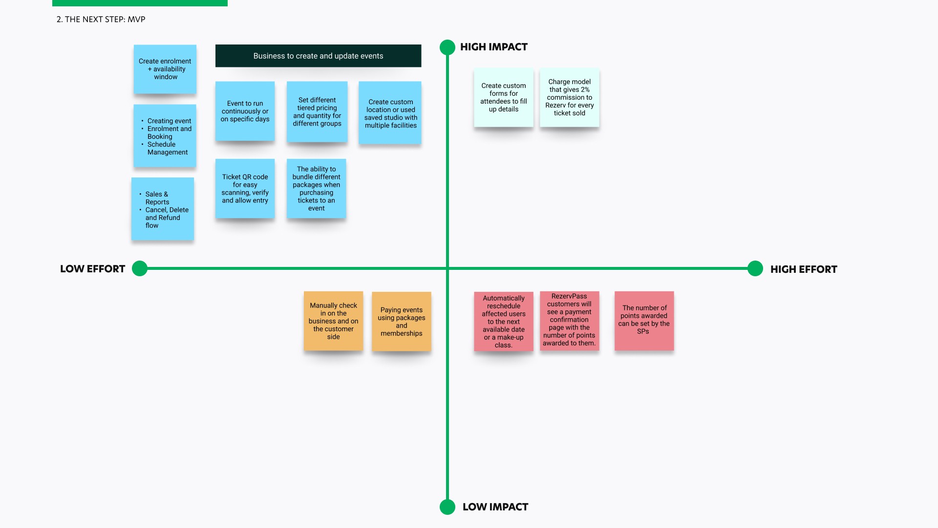
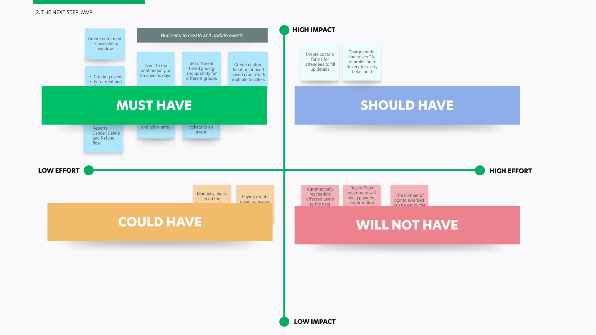
MVP Scoping
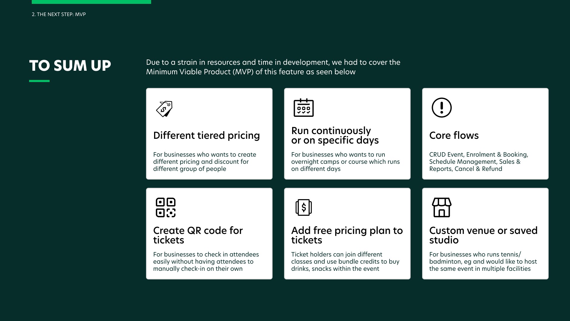
Secondly, due to a strain in resources and time, I conducted an MVP scoping where I focused on the necessary features to support real-world operations at launch.
The goal was to ensure the system could reliably support users, staff, and business processes from day one, while remaining extensible for future feature changes.
Competitor Analysis
Next, I conducted a competitor analysis of event-based platforms to understand established interaction patterns and usability expectations, around how events are structured, presented, and discovered.
I benchmarked key event-related flows — such as event setup, listing, ticket selection, and checkout — to identify common design conventions, pain points, and opportunities.
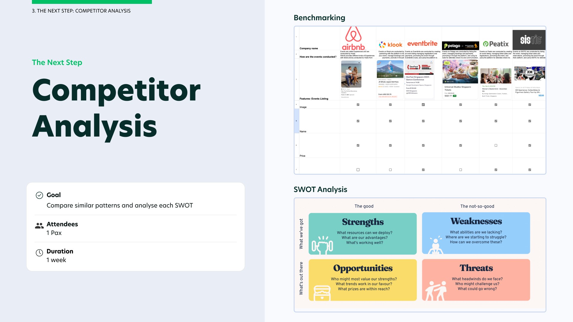
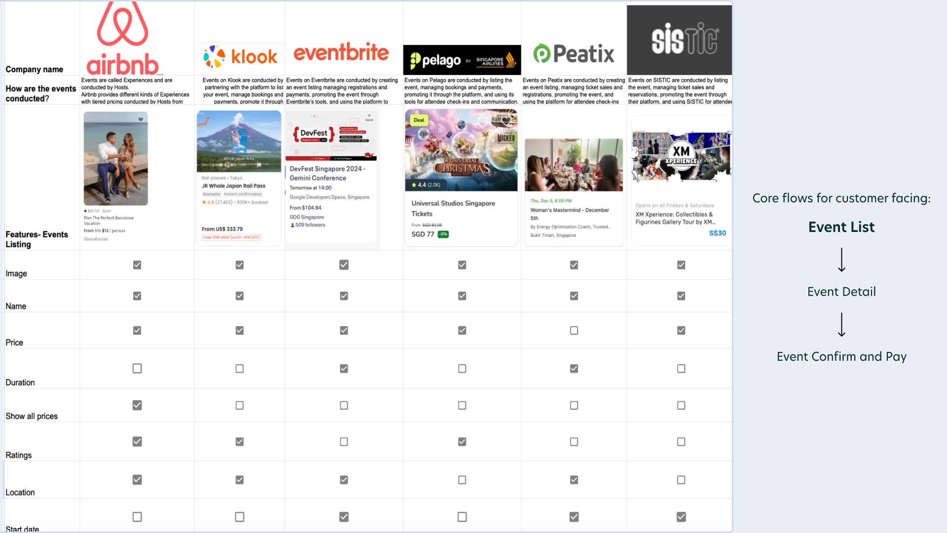
While I compared the competitors, I noticed that majority of them did not indicate duration and start date. This is because majority of these competitors organise events that are ongoing such as attractions. As majority of my use cases tend to be ad-hoc and occur occasionally, I have decided to include a start date and duration in my events listing.
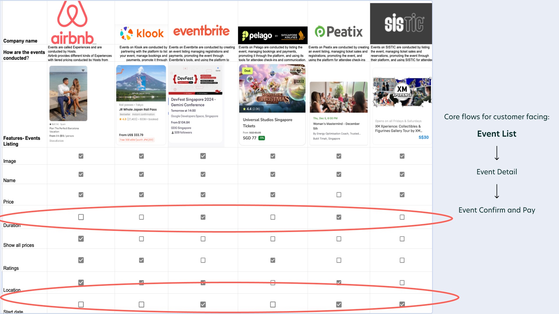
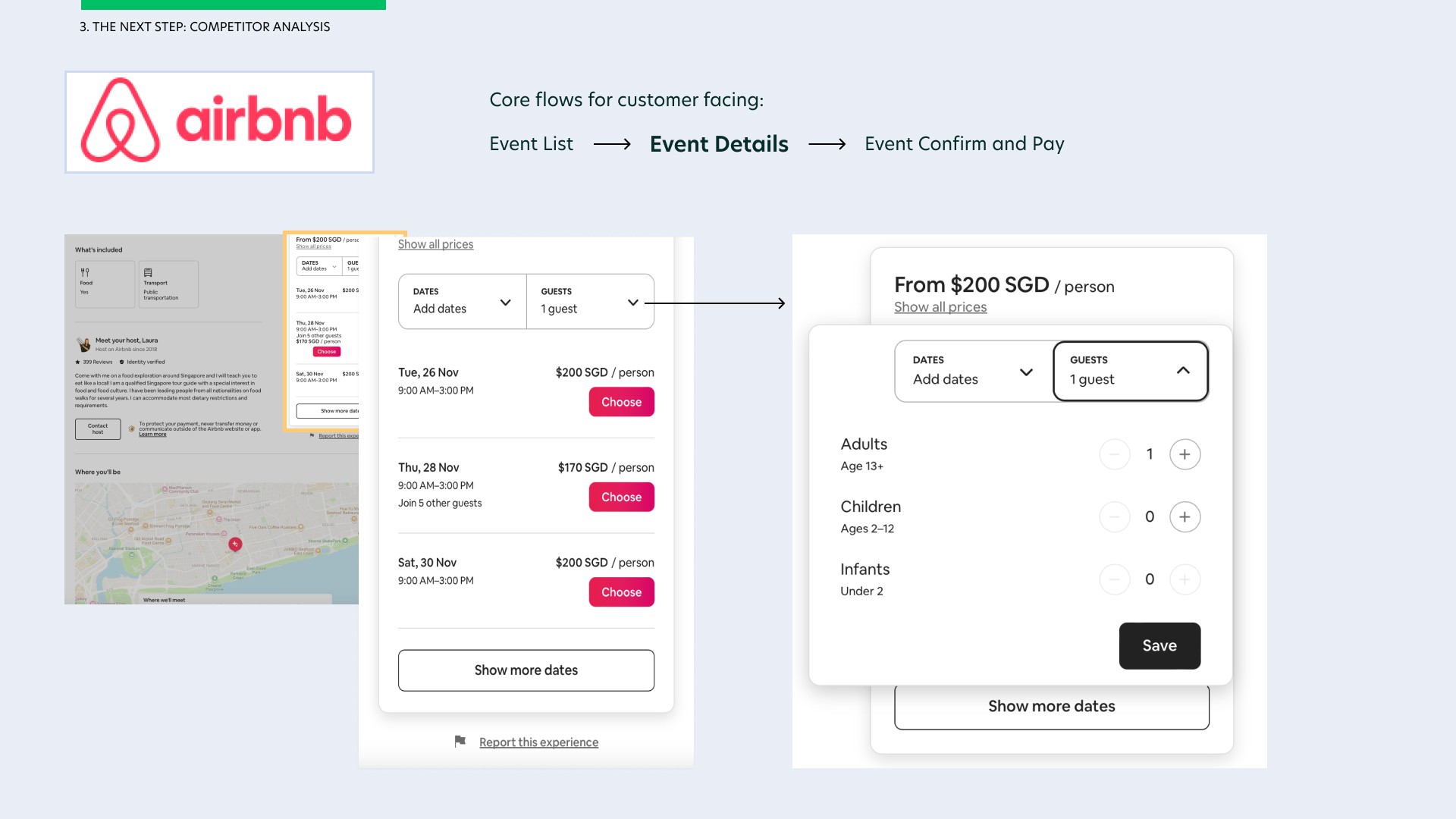
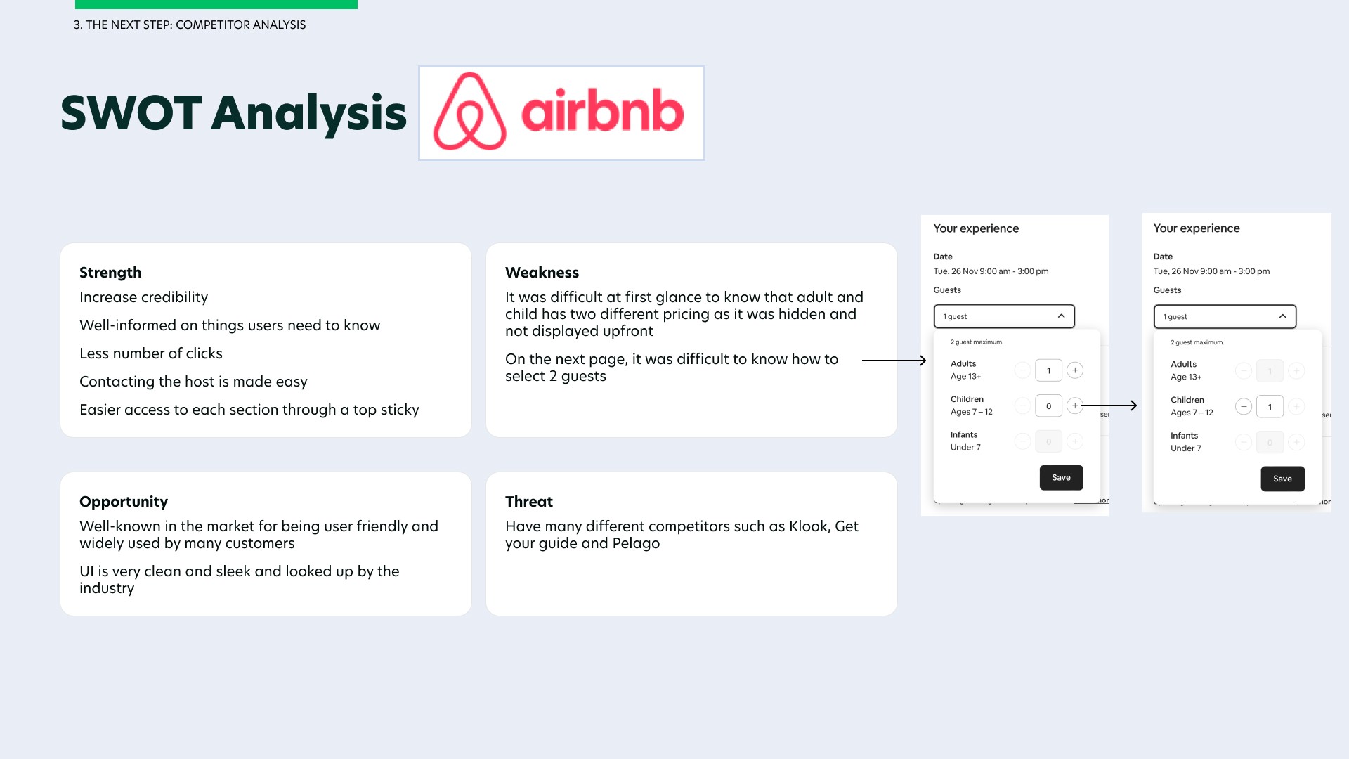
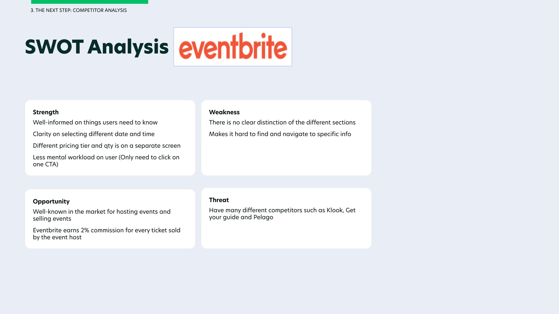
I decided to compare two major event hosting platforms - Airbnb and Eventbrite on their event details user flow and analyse what makes their design user-friendly and what can be improved. After analysing each page, I created a SWOT analysis on the two major competitors, featuring what they both had in common, their strengths and what could be improved from using their platforms.
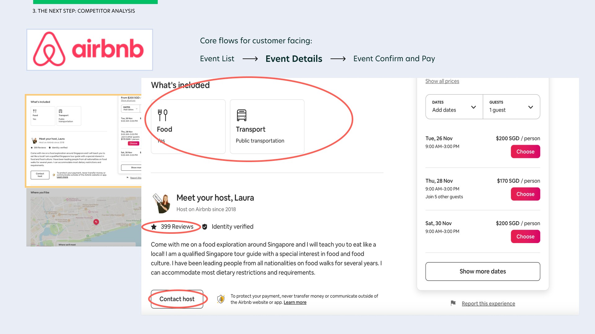
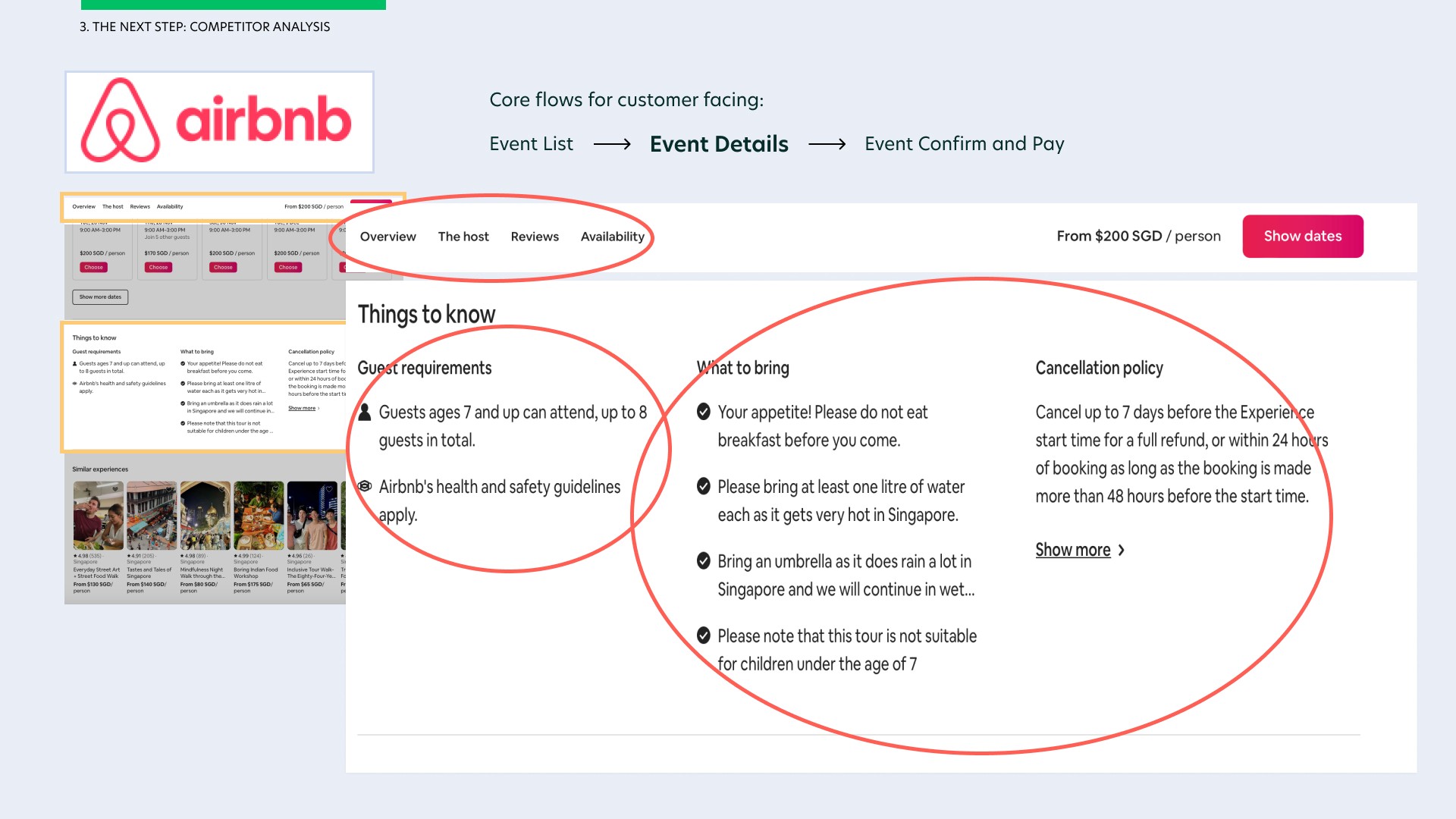
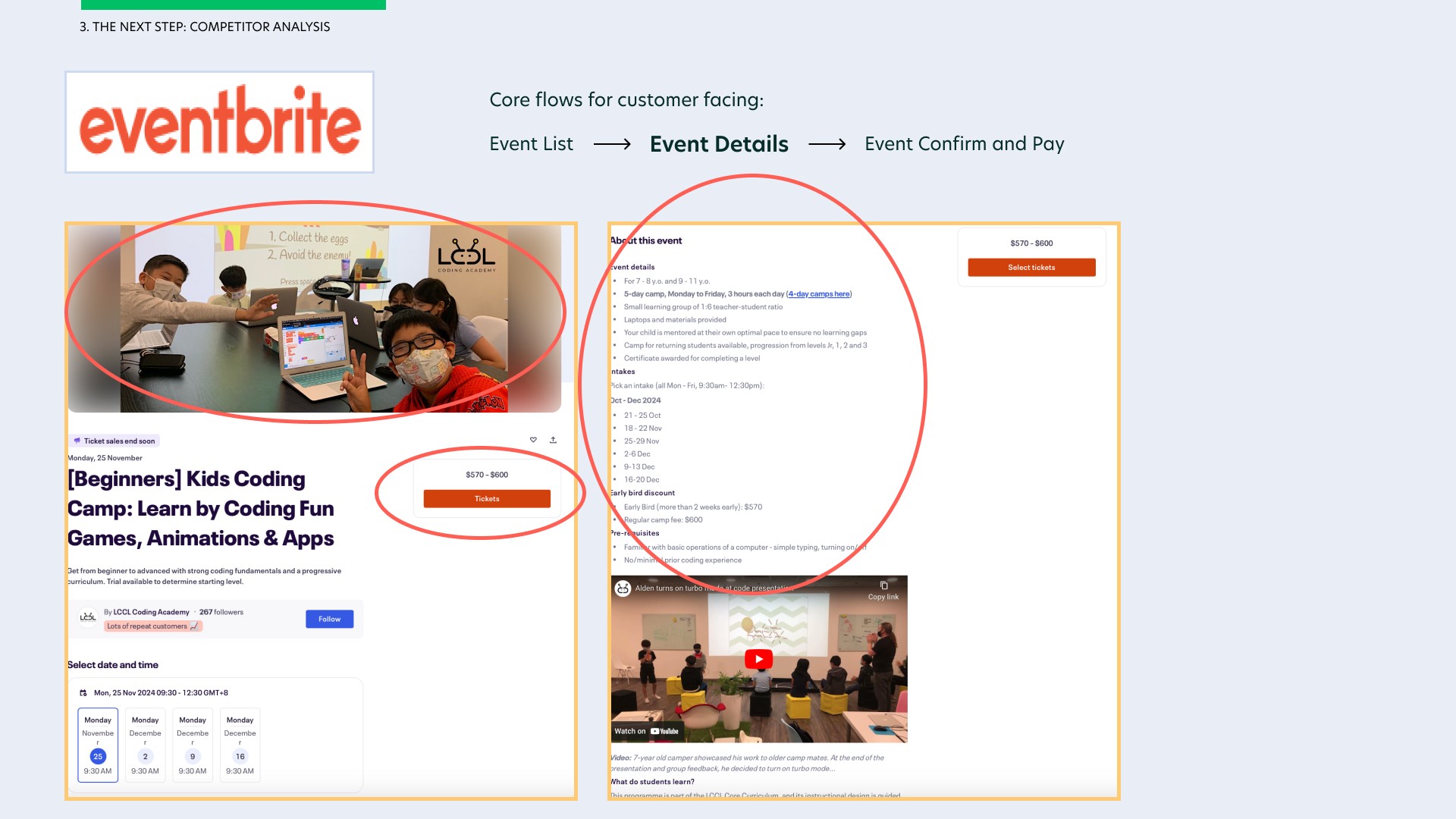
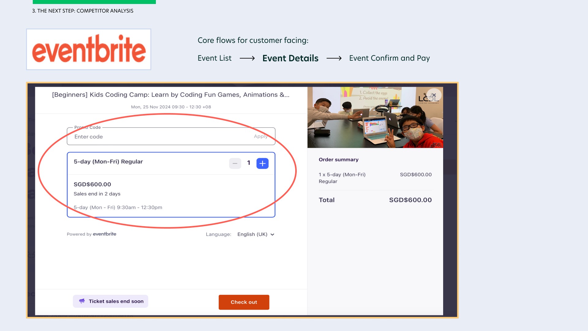
I especially enjoyed how the two competitors include images for their event/workshop, a common CTA to click on tickets, the location, ratings and a huge space for users to write how ever they want in 'the about' section such as things to bring, cancellation policy…etc etc. I love how Airbnb included a top sticky so users can easily access the different sections of the event details by simply selecting on each tab of the top sticky. This was something that Eventbrite did not have, making it difficult to navigate to specific information of 'the about' section.
Airbnb was however not upfront about the different pricing for adult and children, unlike Eventbrite who display every pricing model upfront. Airbnb's method of adding guests was also difficult to understand as opposed to Eventbrite which was easier to use.
Empathising with Users
Empathising with our users is a crucial step in my UX process. This is so that I know what our customers want, the problems they face when using such similar websites and the main urgent thing that they would like solve from the end customers point of view.
To achieve this, I had to find a suitable group of people to conduct interviews with, likely those who often attend events, workshops, classes and gather qualitative responses from them to understand their needs and pain points.
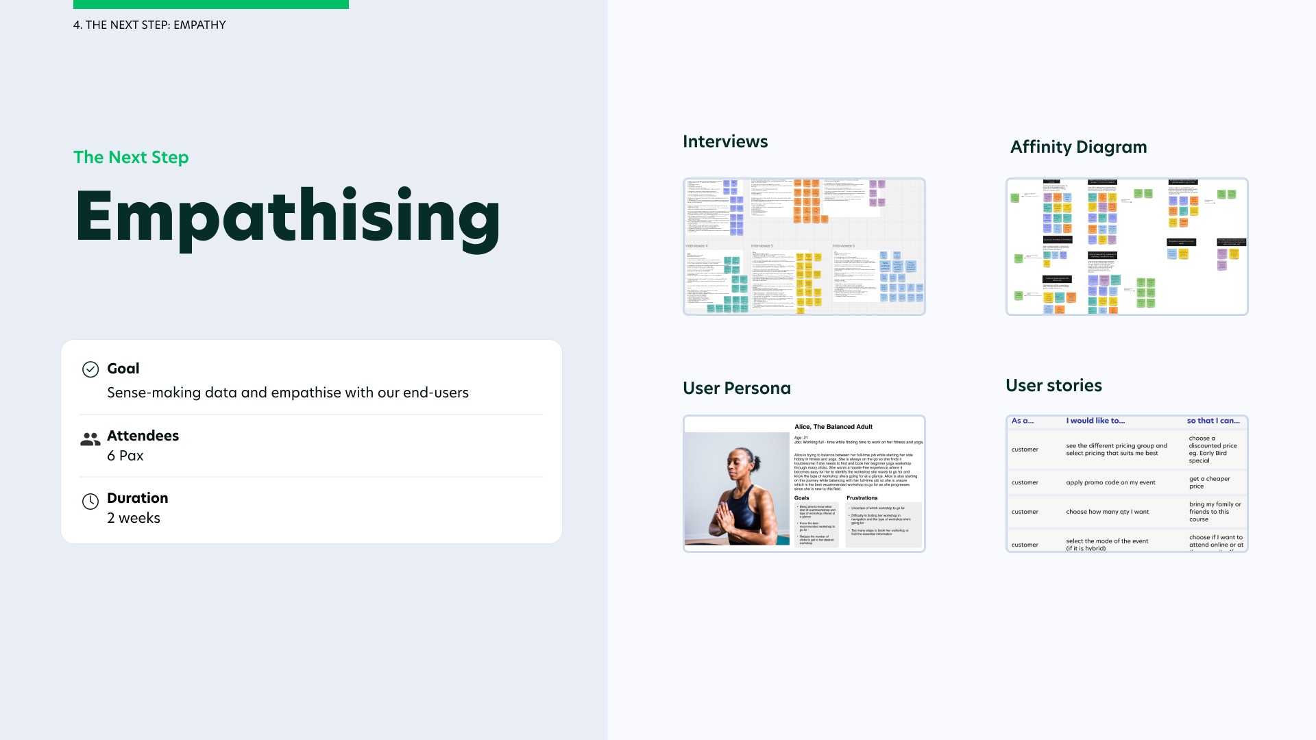
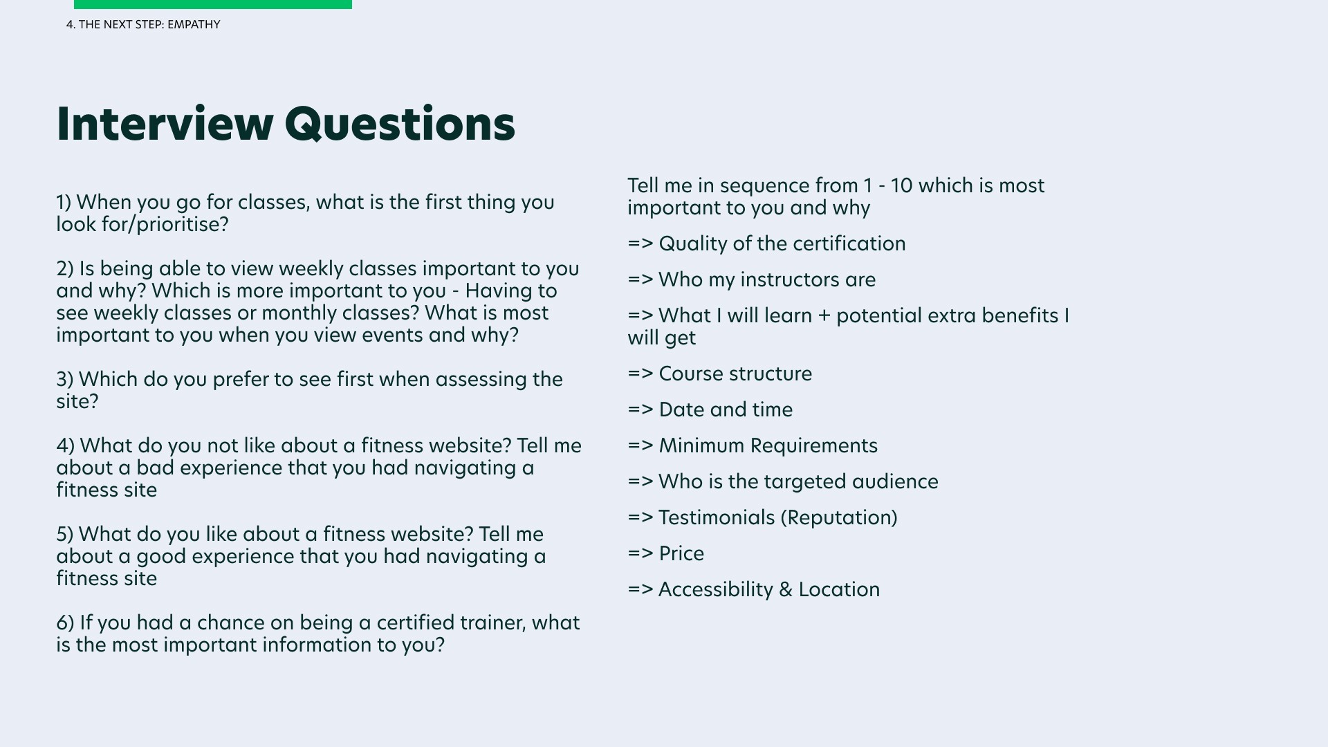
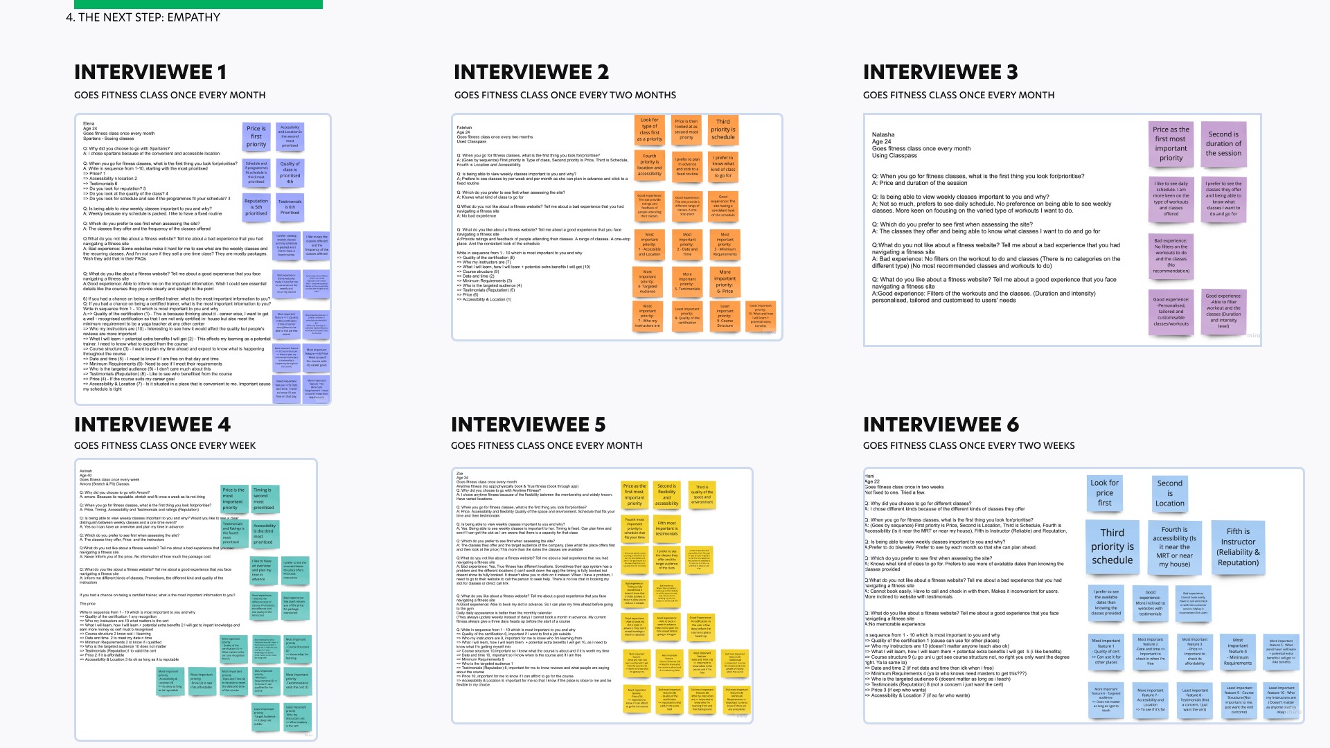
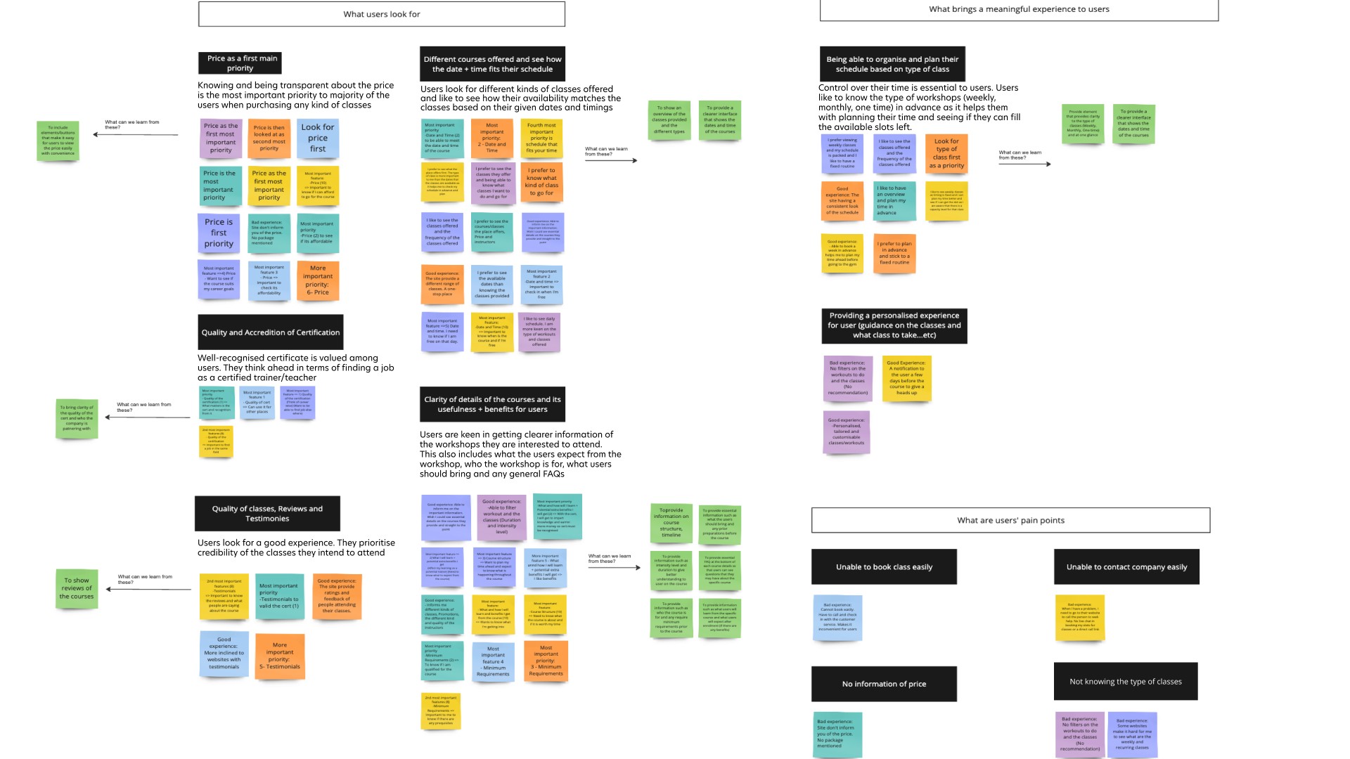
From the interviews that I conducted among 6 end-users, I created an affinity diagram to synthesise the data and categorise them by users’ needs, their pain-points in using other fitness websites and what brings a meaningful experience to them.
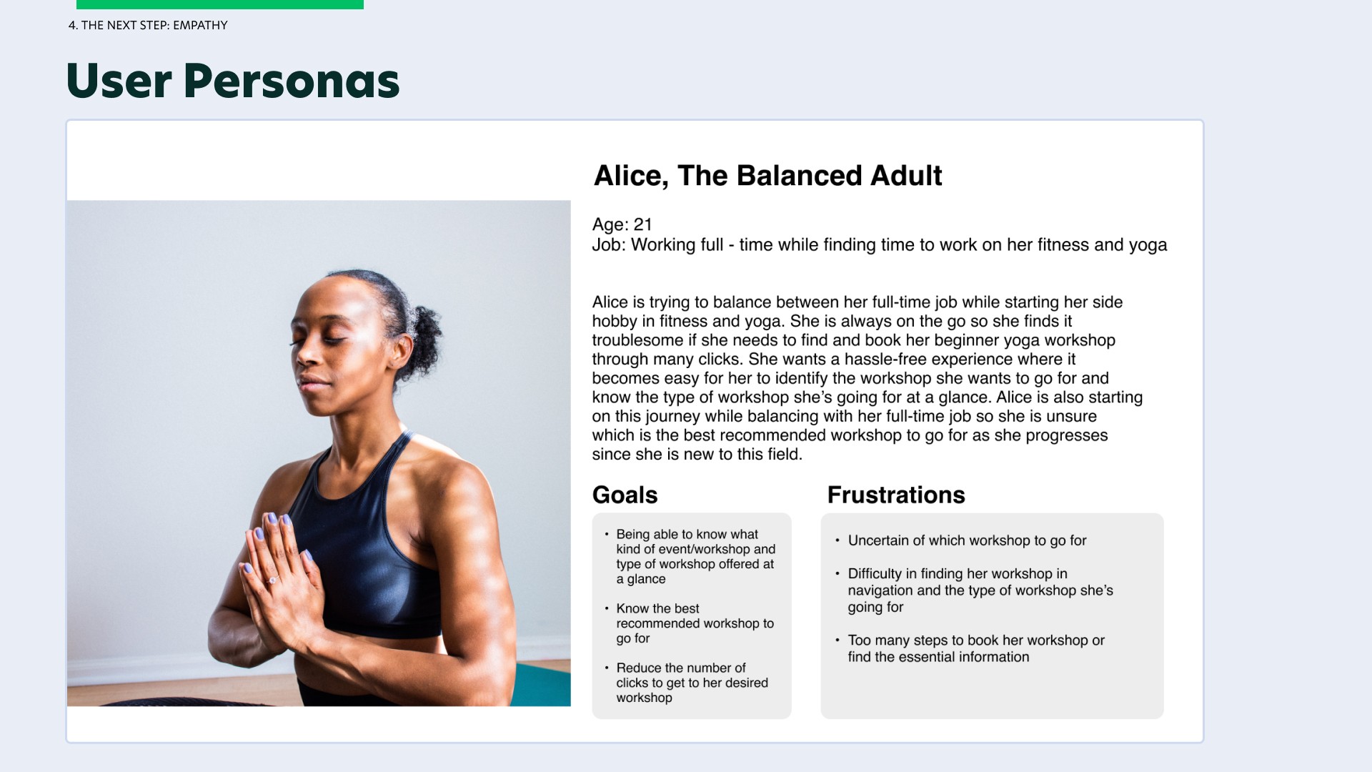
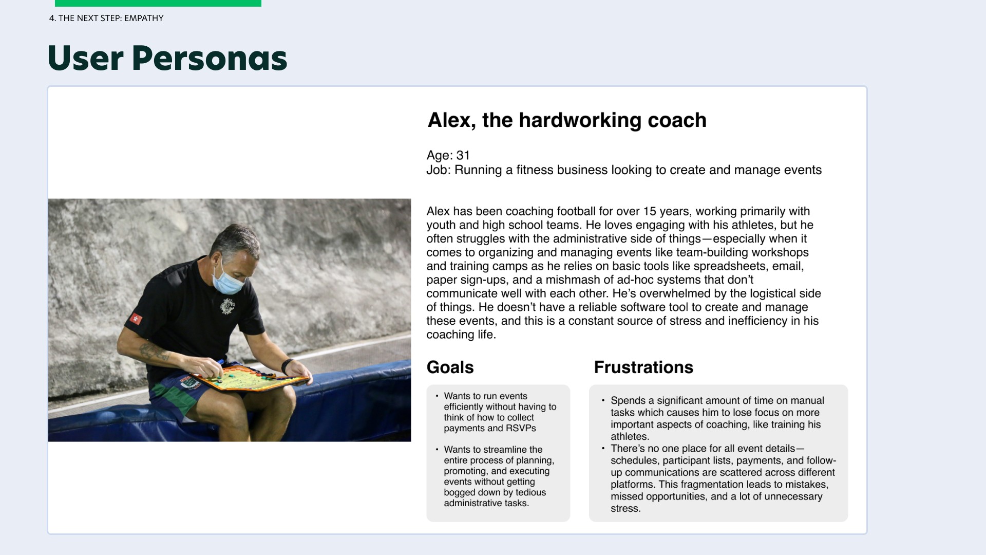
Afterwards, I created two different user personas (one being the customer end user and the other being fitness business user) to visualise being in their shoes and better empathise with our users' needs + pain points.
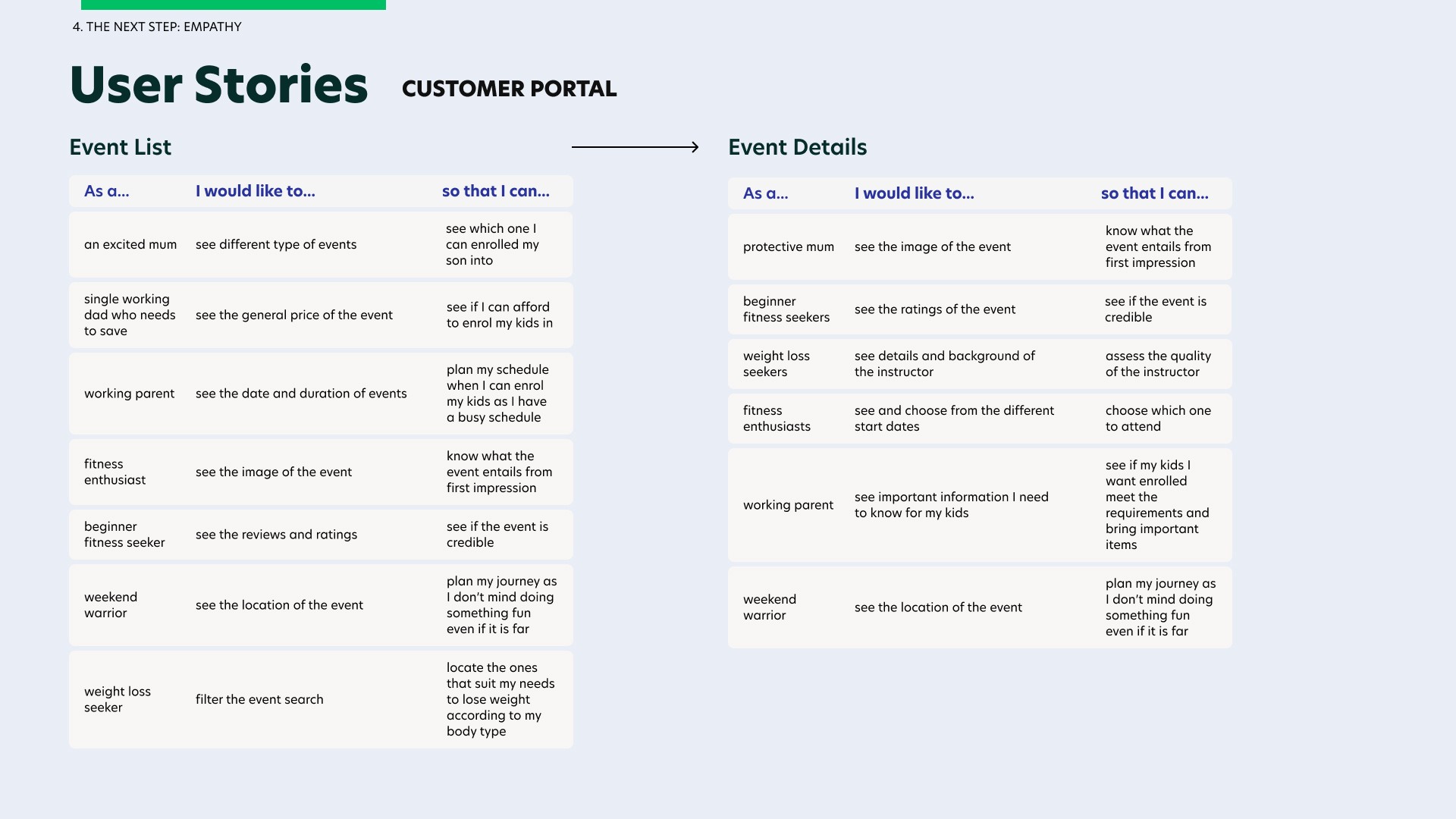
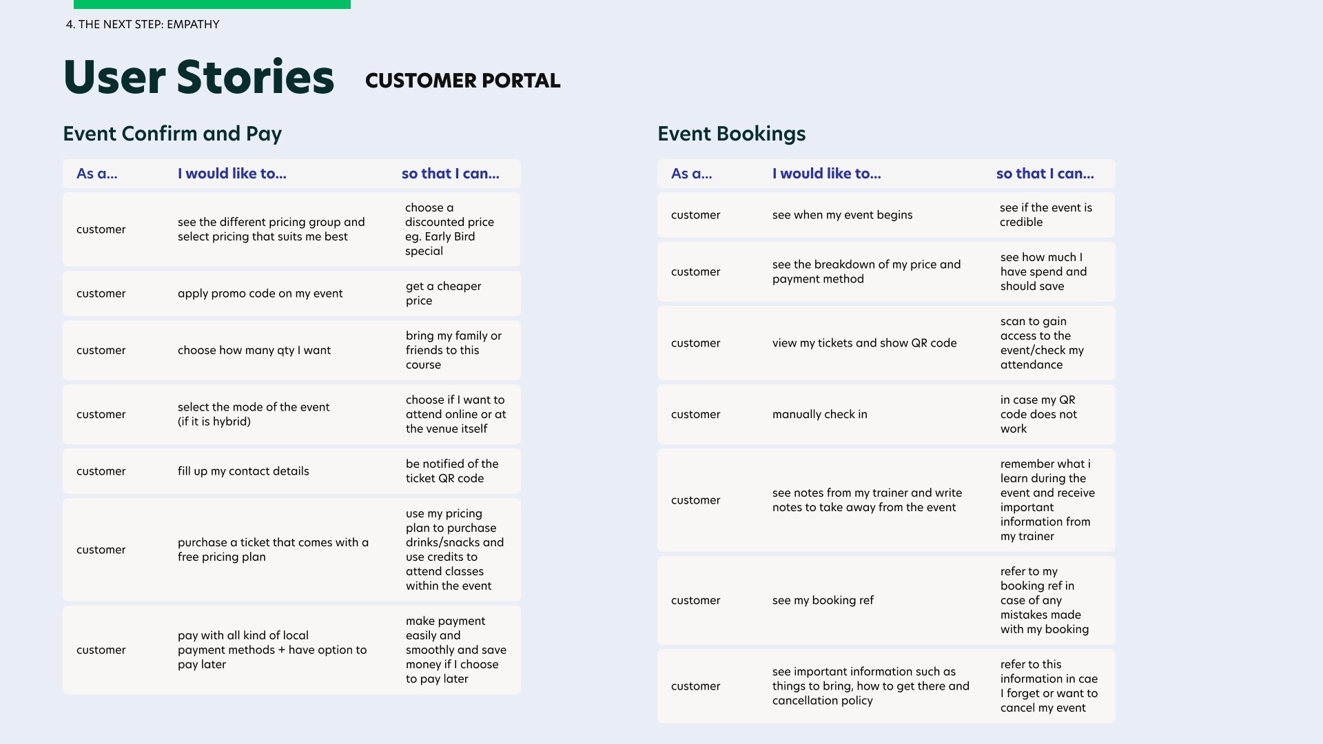
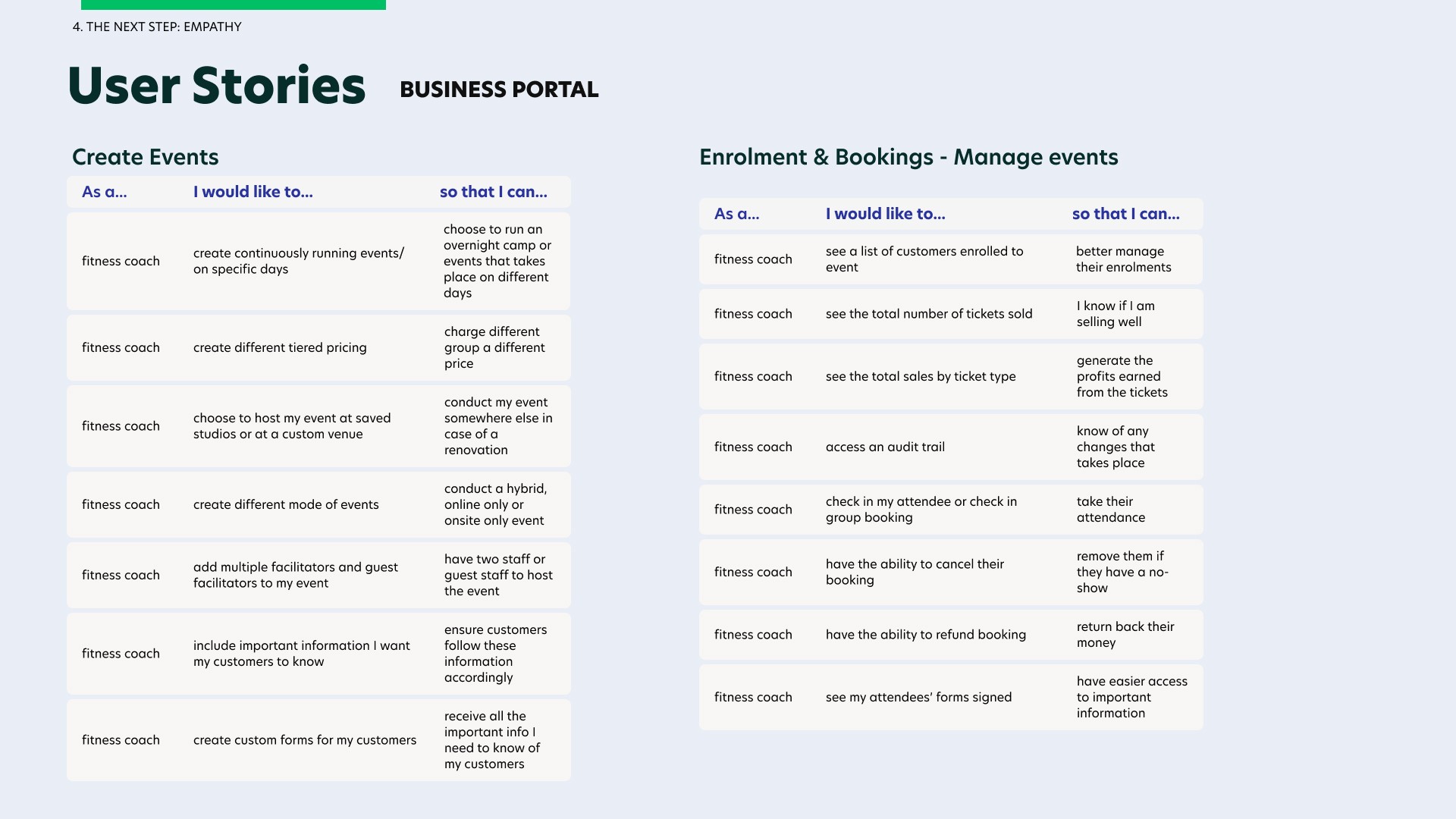
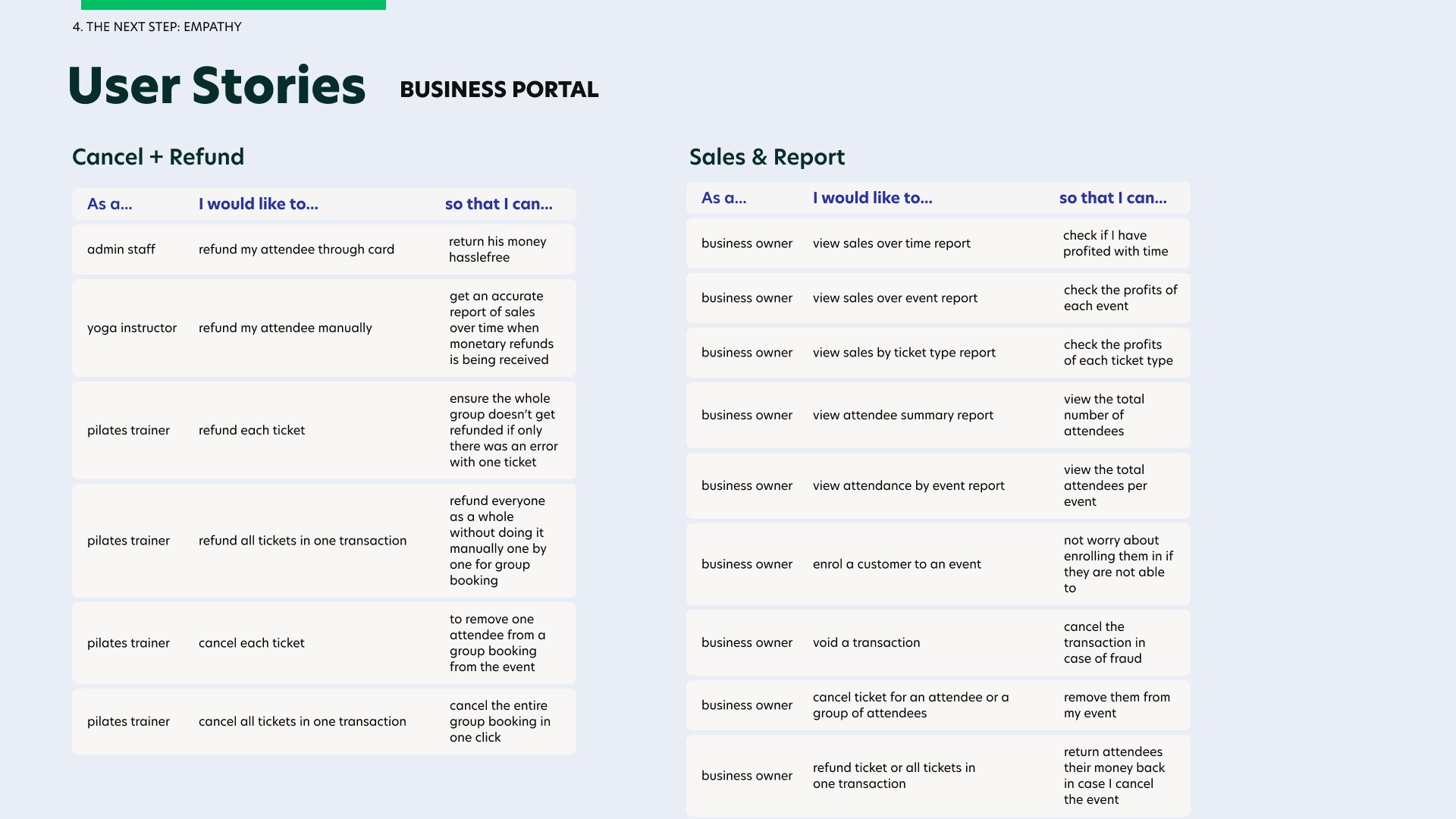
From the different user personas, I crafted out different user stories on both the customer portal and business portal to gather the important user flows I need to design based on their needs + pain points.
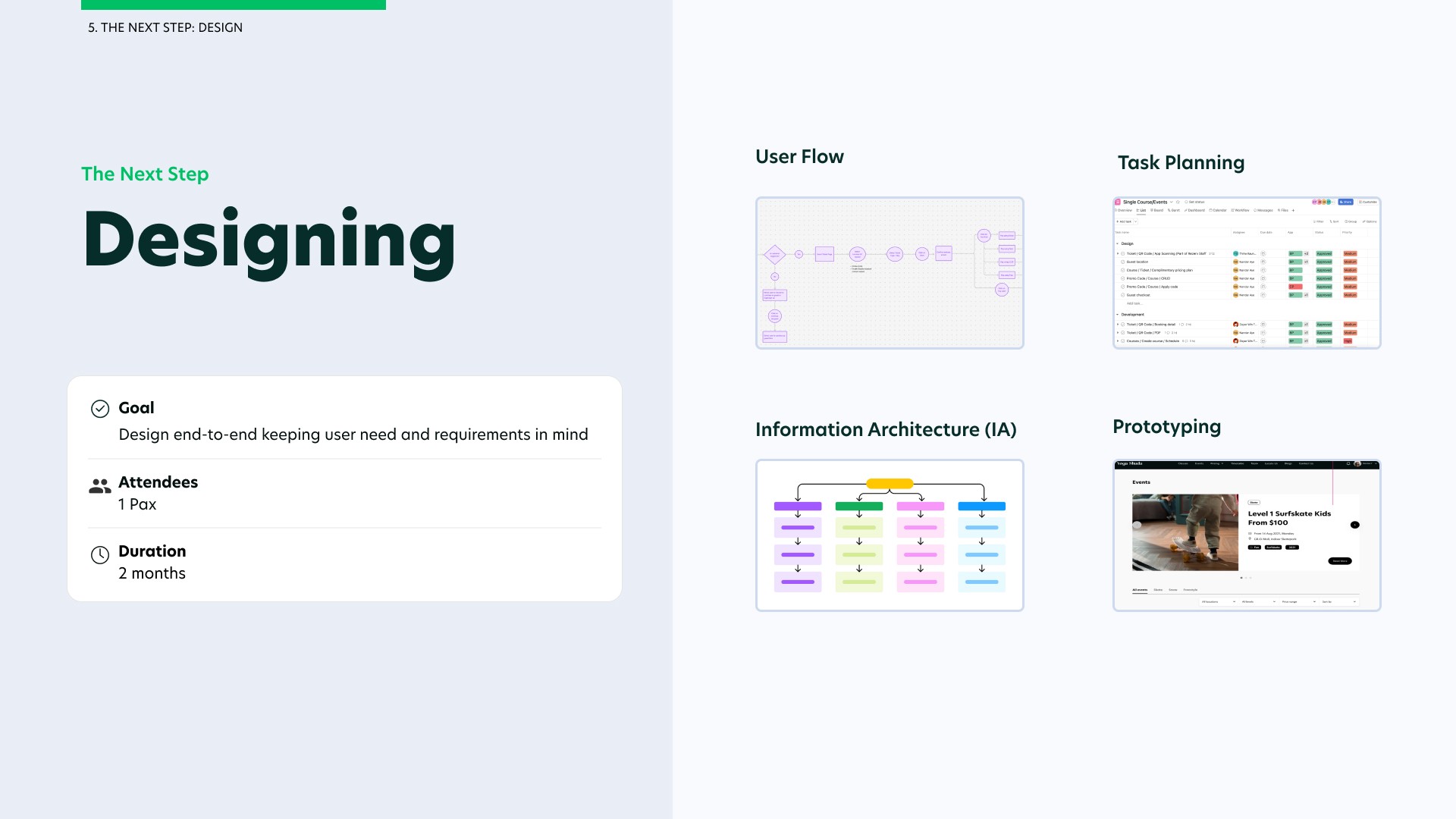
Designing for Users
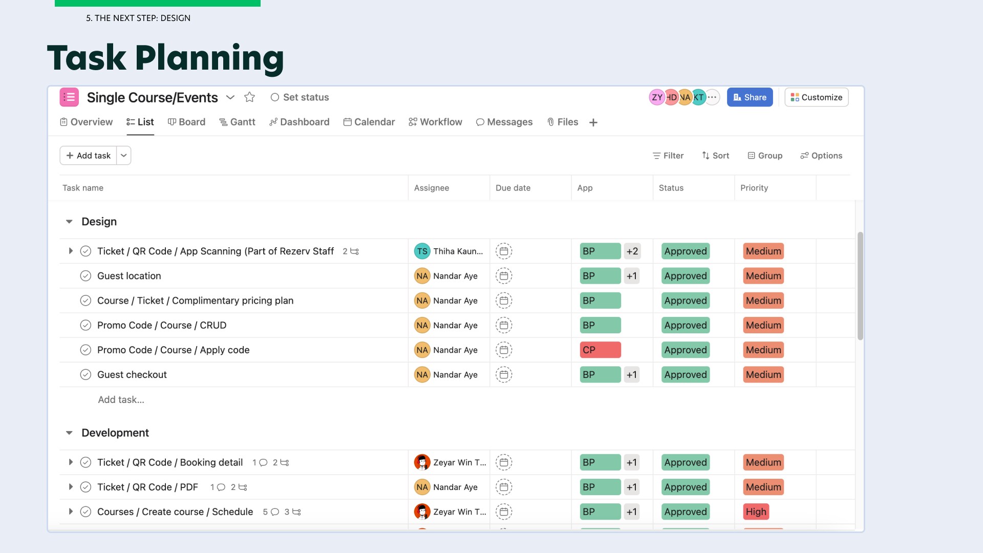
The next step is to design for our end users in mind which includes both the business users and the customers. To do this, I would need to draft out the user flows. This is where the product manager would plan the tasks for me and my deadlines so that developers are informed and aware.
After which, I would come up with the information architecture (IA) of each screen, the fidelity prototype while getting end users to test on the product and lastly coming up with the final design where users' requirements are met and end-users are happy with the design.
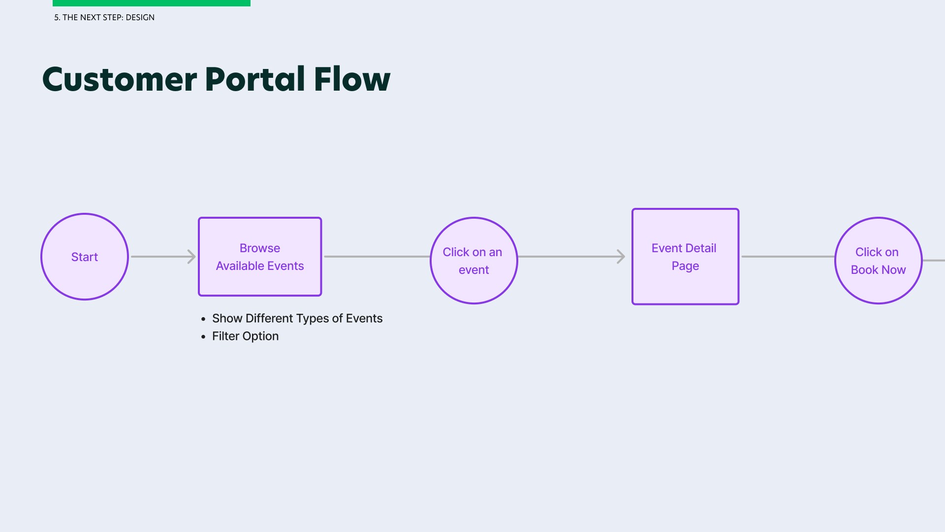
Before I start designing the different screens, it is very important for me to visualise the user flows we need for both the customer portal and business portal.
For simplicity sake, I will only be showcasing the user flow affecting the customer portal as there are many different modules that will be affected on the business portal.
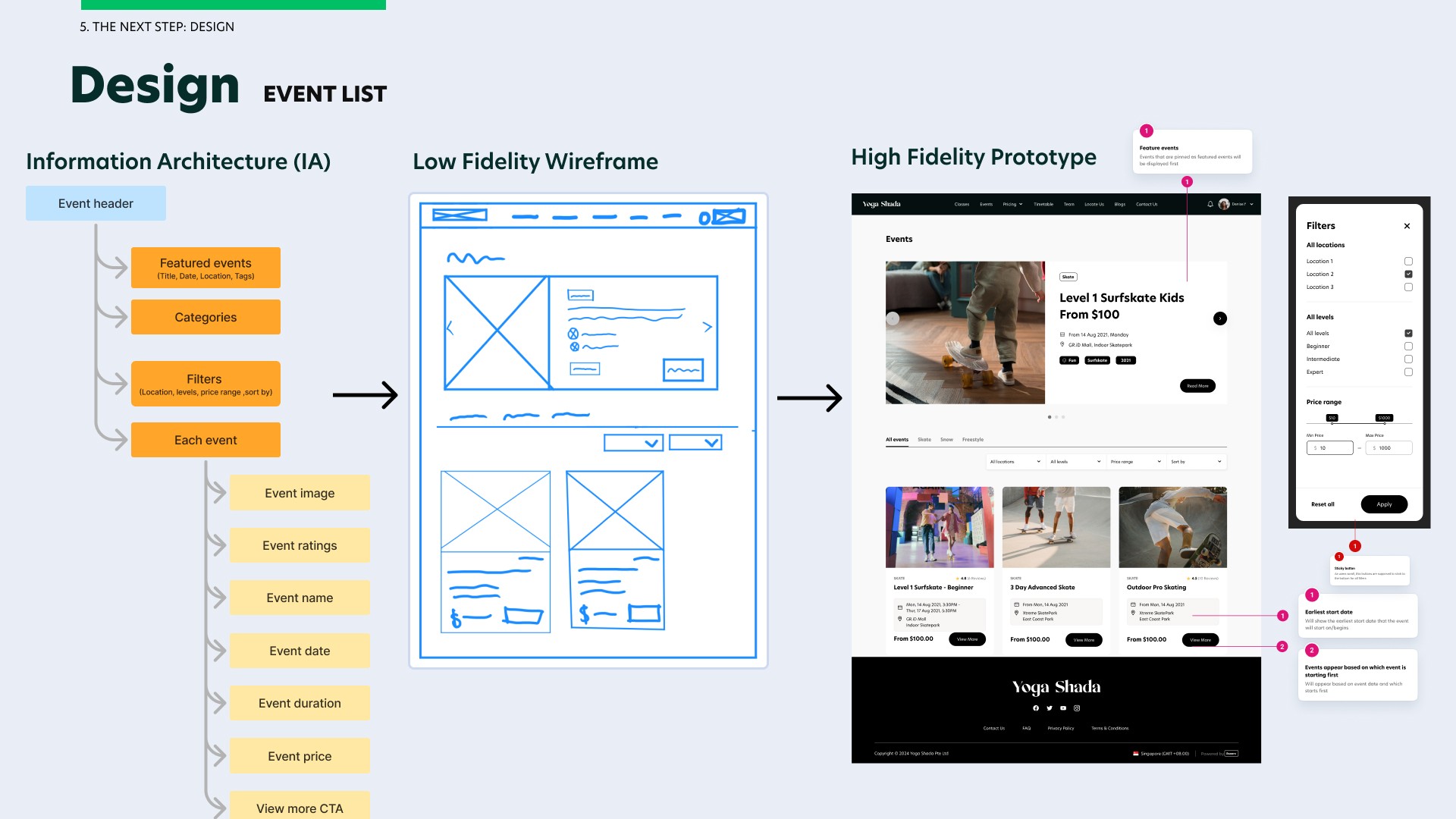
Once I understood the user flow, I crafted out the information architecture (IA) of each screen to finalise the content, all the while ensuring my stakeholders are aware and approve the content. I came up with the low fidelity wireframe and used the components from the Design System to design the features requested while ensuring consistency in our design standards throughout the software.
As a UX designer, I also ensured that all the dependencies of every user flow is met and the negative flow for each module is also accommodated for.
The final designs for the customer portal are organised into five key screens: the Events List Page, Events Details Page, Events Ticketing Page, Confirm & Pay Page and Events Bookings. I will present these final designs along with the design decisions behind them in the outcome section of this portfolio.
Process for Event List on Figma
I started the design with an IA of the event list then proceeded with a low fidelity wireframe to structure the layout of the events page, then the mid fidelity wireframe and lastly the high fidelity prototype. These designs are also optimised to fit phone and tablet view.
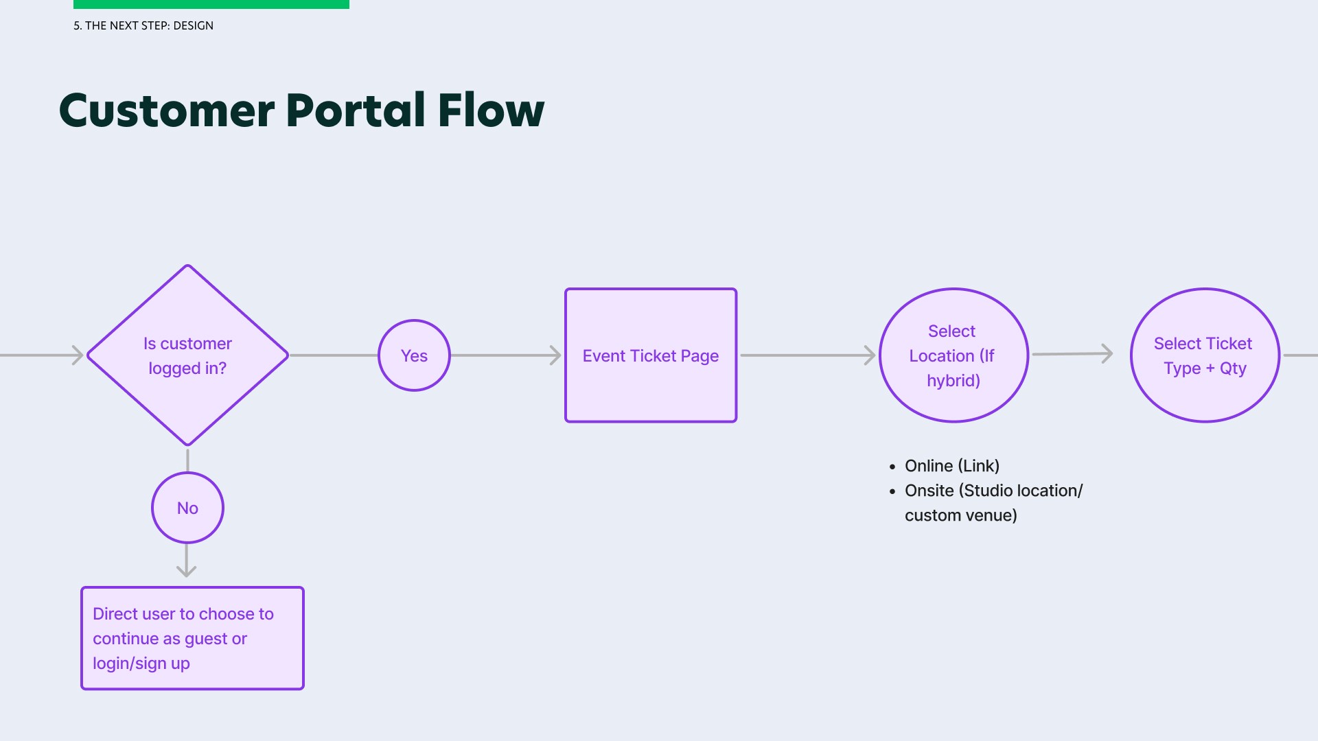
User Flow for Event List on Figma
I created different states for phone view, tablet view, as well as empty state and certain notecards for developers to take note.
User Flow for Event Detail on Figma
I added conditions such as if the event is free, if the event takes place on one day, run continuously or on different days.

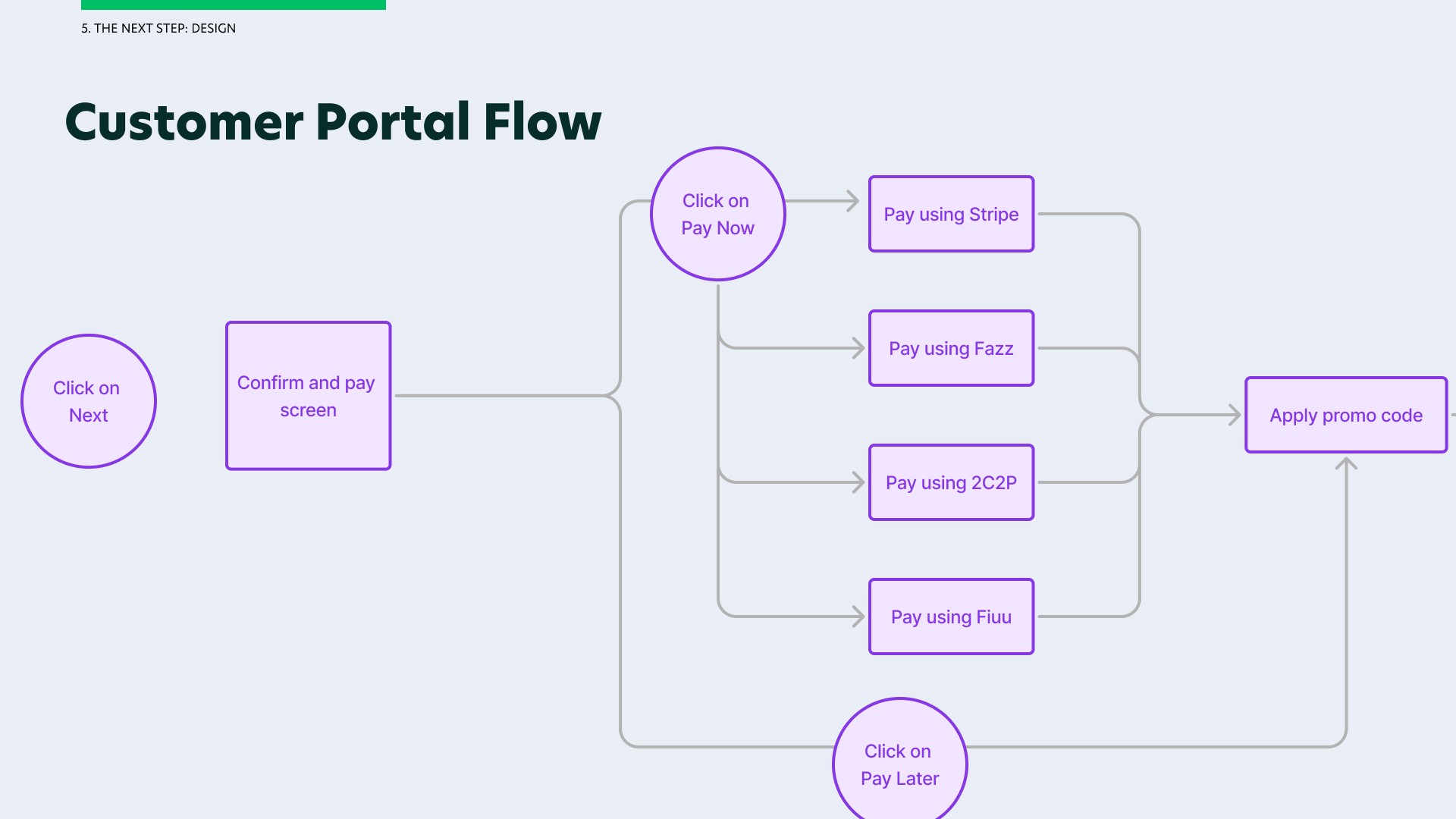
User Flow for Event Ticketing and Confirm & Pay on Figma
I have included different specifications/states, a local component library and the different scenarios/use cases and their individual flow.
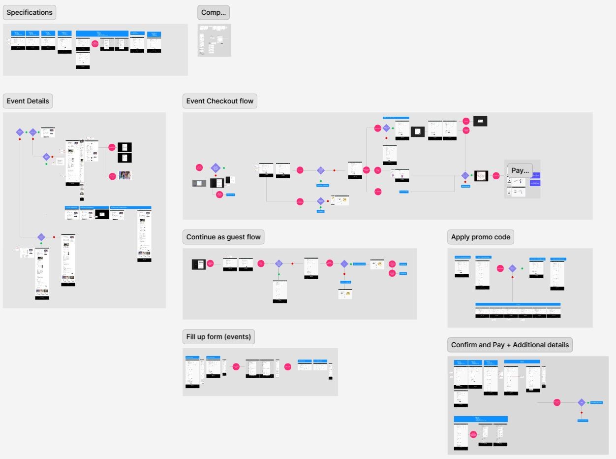
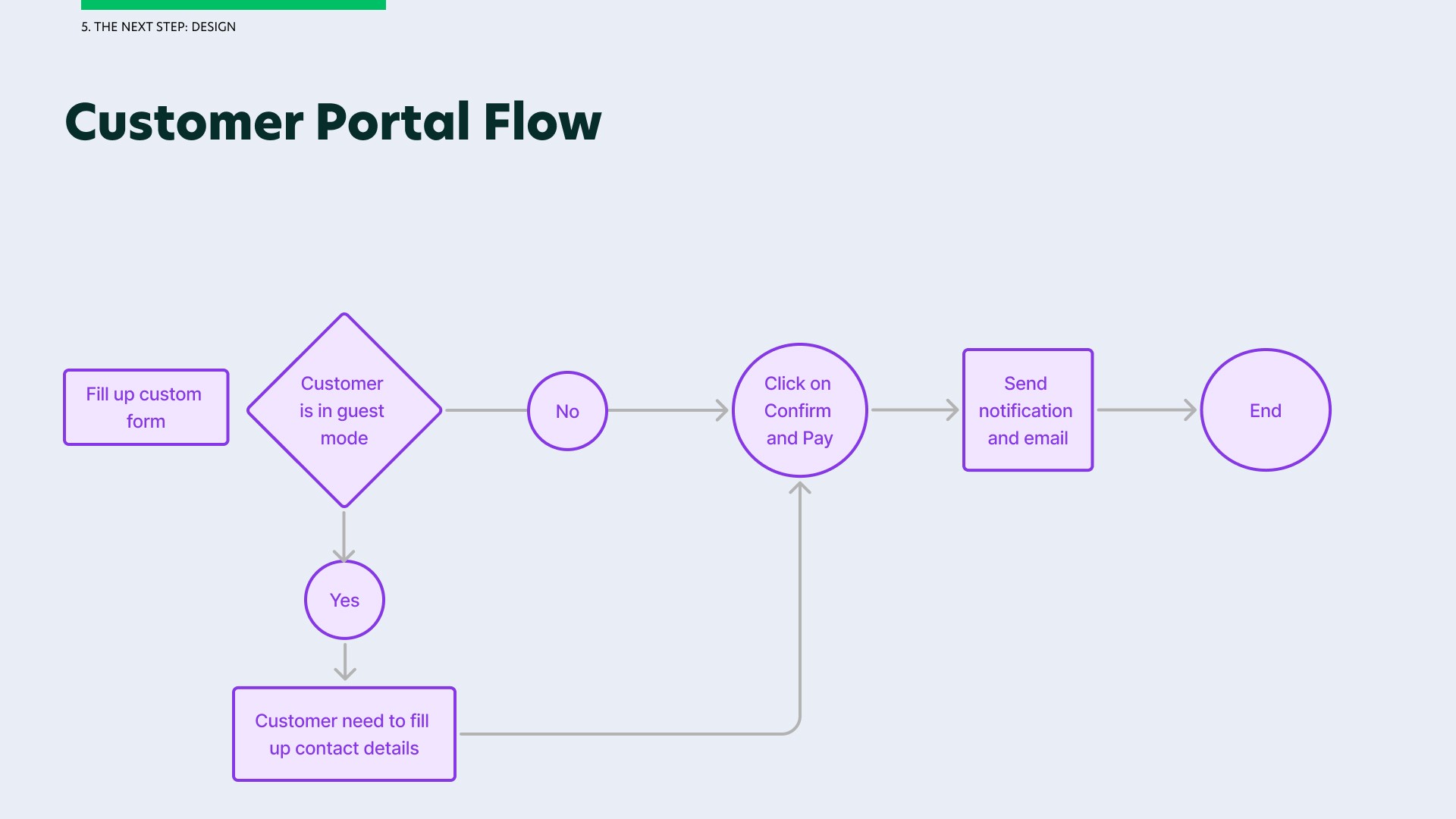
User Flow for Event Bookings on Figma
Here are the different user flows and dependencies for events booking feature in the customer portal.
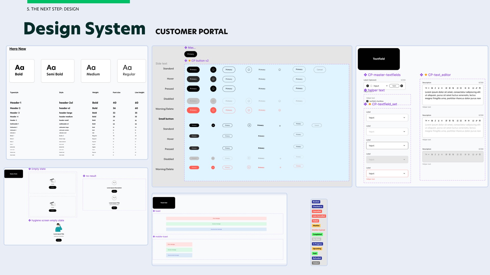
Working with the Design System
I would like to showcase the fundamentals from our component library in our design system to reuse across all screens in the same userflow. This is where I reused similar components for fonts, buttons, textfield, toast, status chips and empty state.
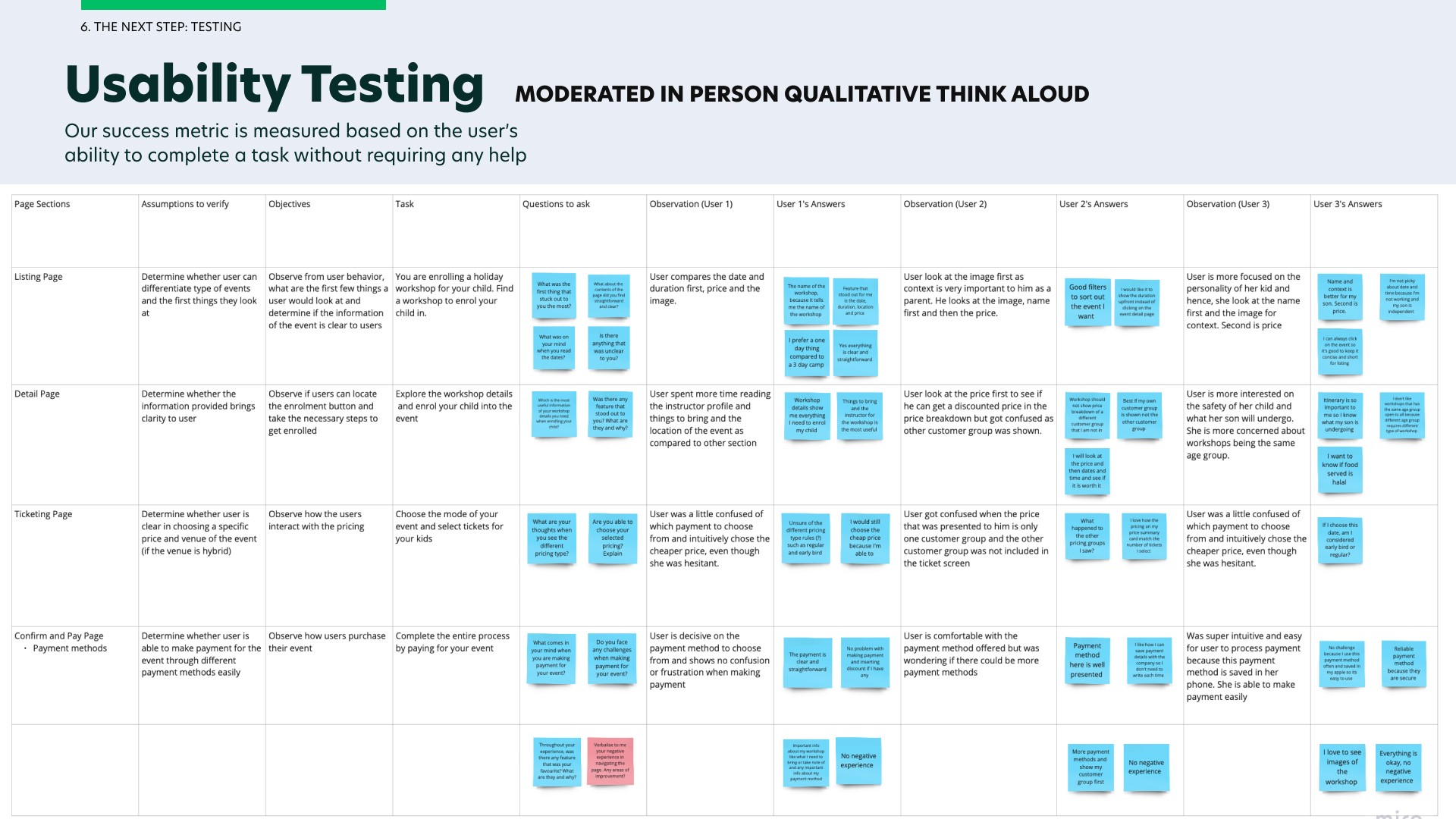
User Testing
I conducted my user testing throughout the prototyping phase. This is important to me as I put users' needs first. I wanted to ensure that users' needs and problems are met and our end-users are satisfied with our product.
For simplicity sake, I will only showcase the usability testing conducted on the customer portal as there are a lot to cover on the business portal.
I conducted the usability testing among 3 end users on the customer portal by getting our users to think aloud. Our success metrics is to get them to complete a task without any help. At the end, I would ask questions on what they prefer improve and this is how I was able to gather insights on the users' needs. Our users comprises of parents and fitness enthusiasts as I notice that our clients are mainly targeting families and enthusiasts of different age group when organising one time events and workshops.
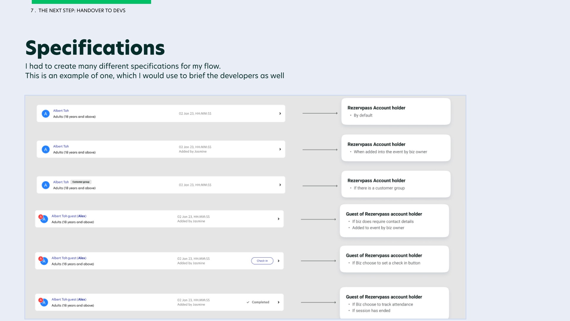
Handover to Developers
Once user testing is complete and design has been approved by my stakeholders, the last and important step is to handover to the developers.
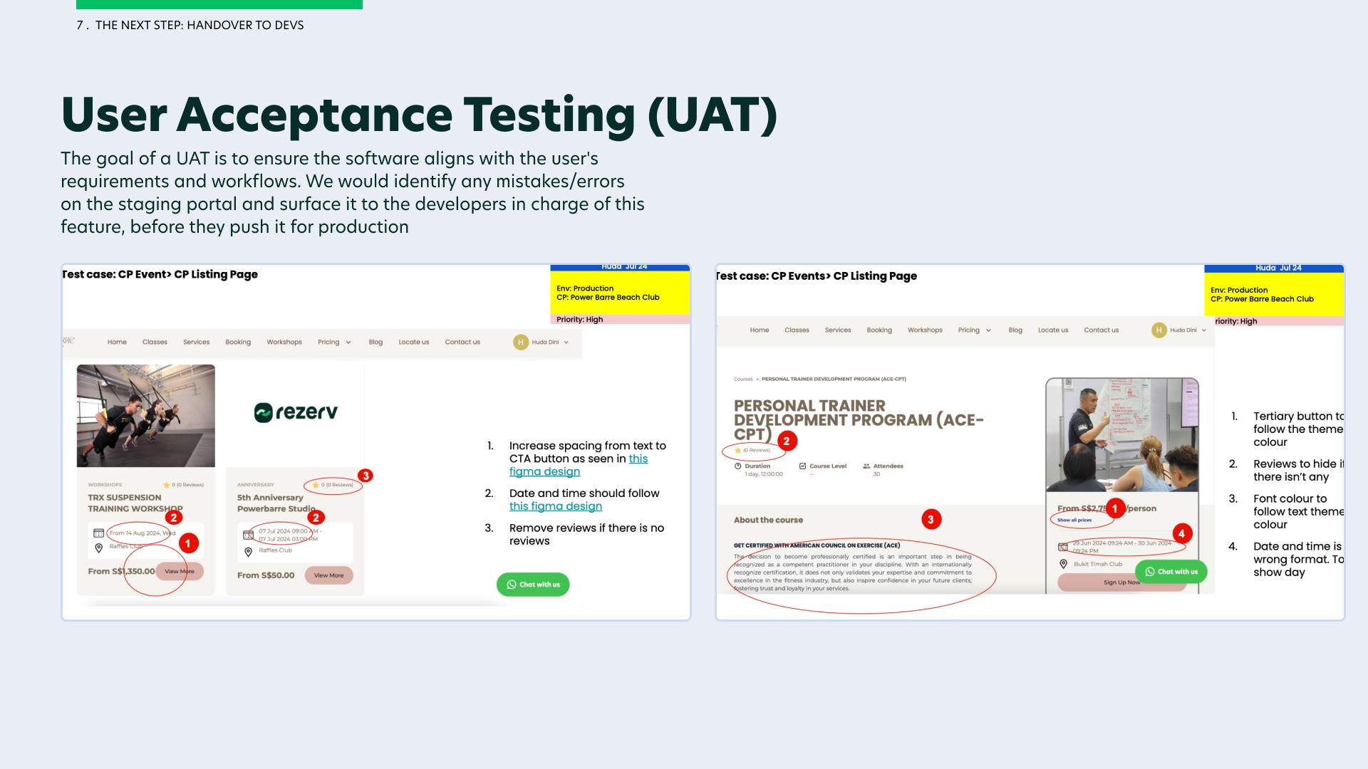
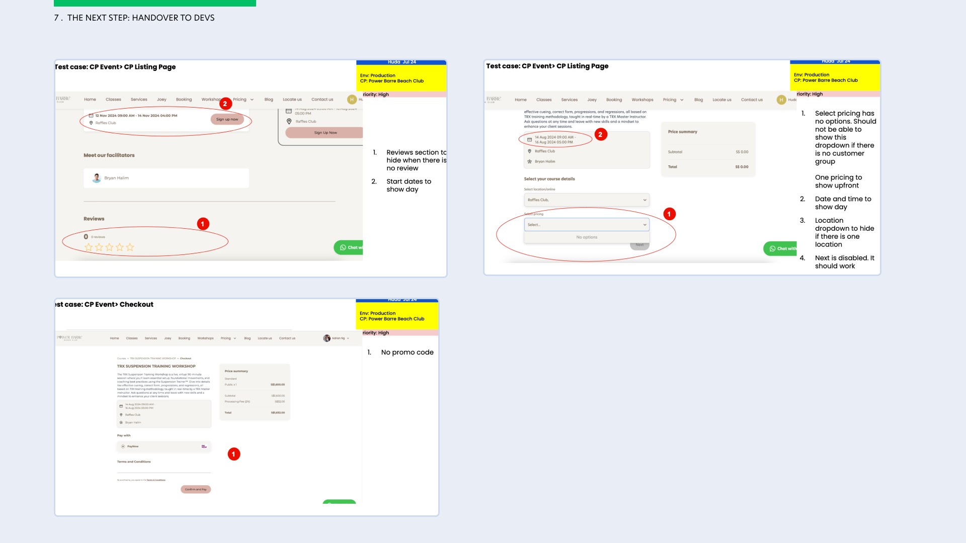
Here, the different specifications and notecards are needed so that developers are aware of the different states and conditions that they have to abide by. As the feature gets developed, a user acceptance test (UAT) is prepared by the product manager and checked thoroughly by me so that I can catch mistakes early and inform the developers before pushing this feature live onto production for our end-users.
What was the outcome?
Final Design (Customer Portal) - Live client: Meraki Movement Co
Here is the final design for solely the customer portal used by one of Rezerv's clients, Meraki Movement Co. I will not be showcasing the final design for the business portal as they are extensive and some flows are confidential. I have shared the link to the figma files below, feel free to have a look.
Final Design (Figma Files)
NOTE: These figma files does not showcase all the flows I have designed for this module. Some flows are designed within the software and are confidential.
Final Design (Customer Portal)
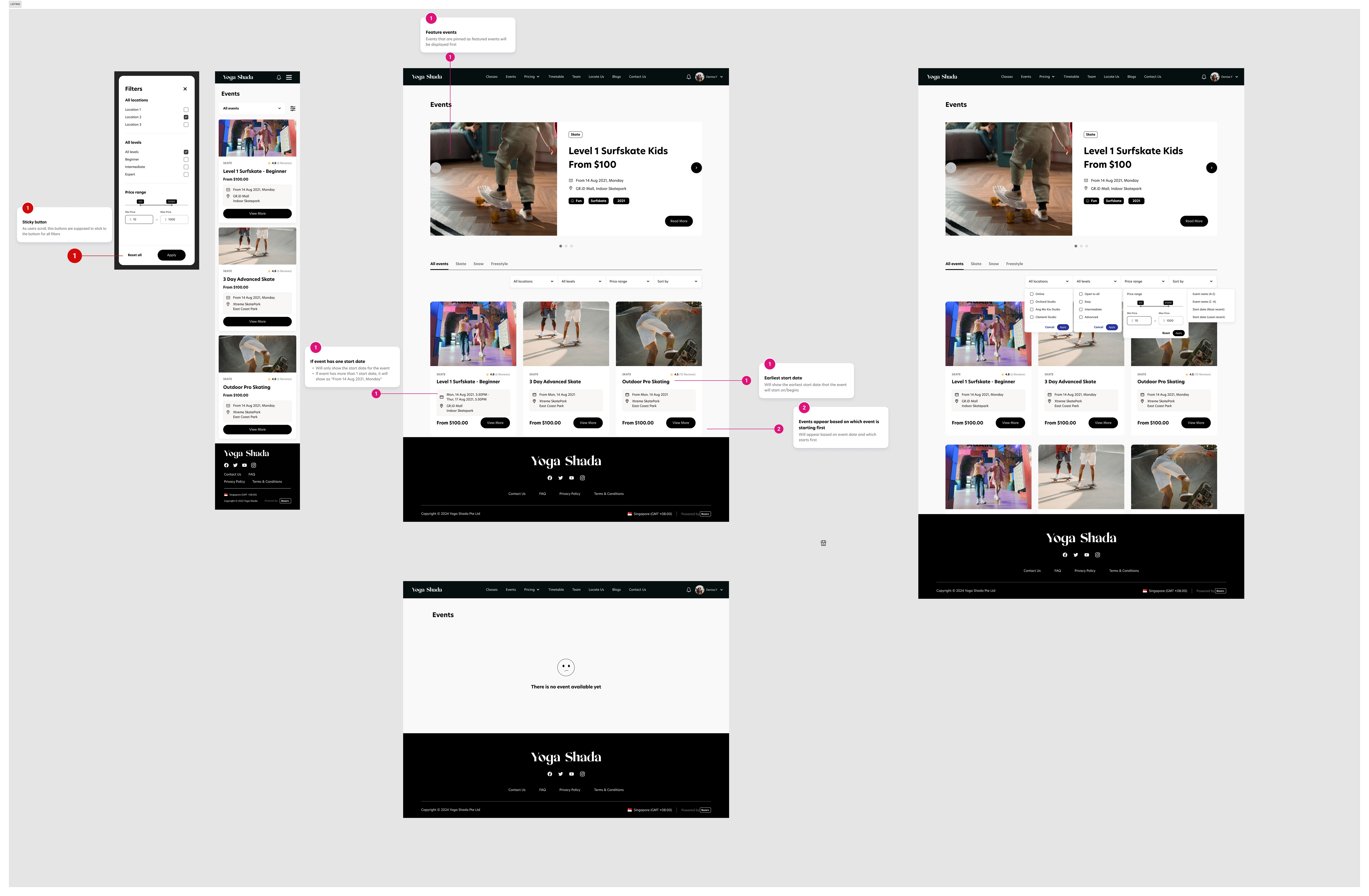
Design for Event List
My final design is based on the benchmarking UX analysis and the usability testing that I have conducted. Feel free to click on each purple plus icon to learn more about my design decisions.

Design for Event Detail
Upon clicking on "View More" on the Event Listing page, I will land on Event Detail page (as the one you see below). I incorporated certain features from Airbnb and Eventbrite that were user-friendly based on my UX comparative analysis and insights gathered from my usability testing into the event details page. Feel free to click on each purple plus icon to learn more about my design decisions.


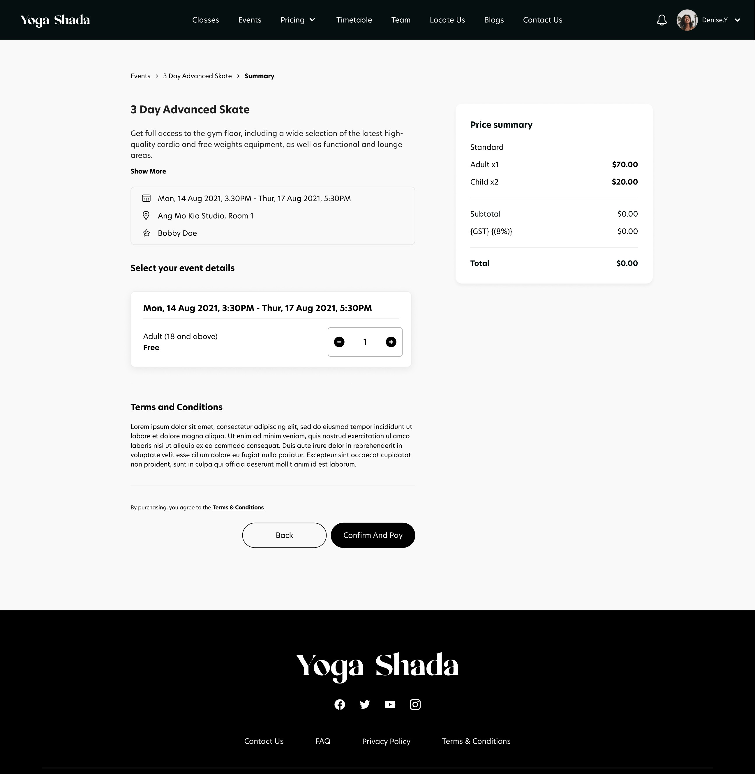
Design for Event Ticketing
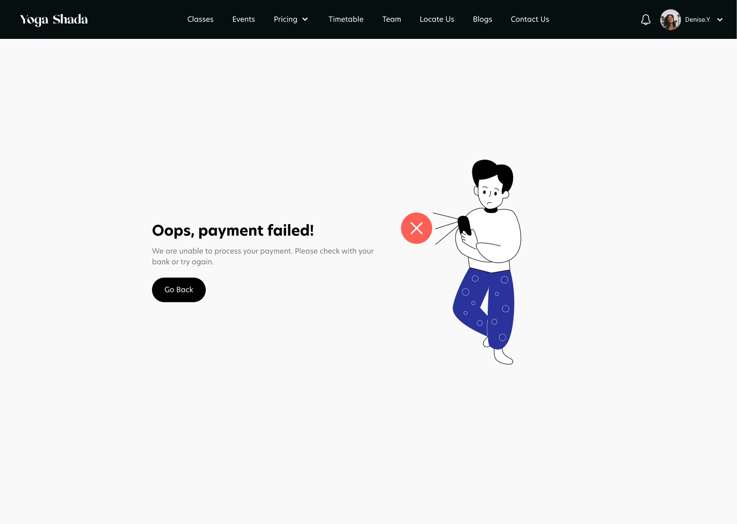
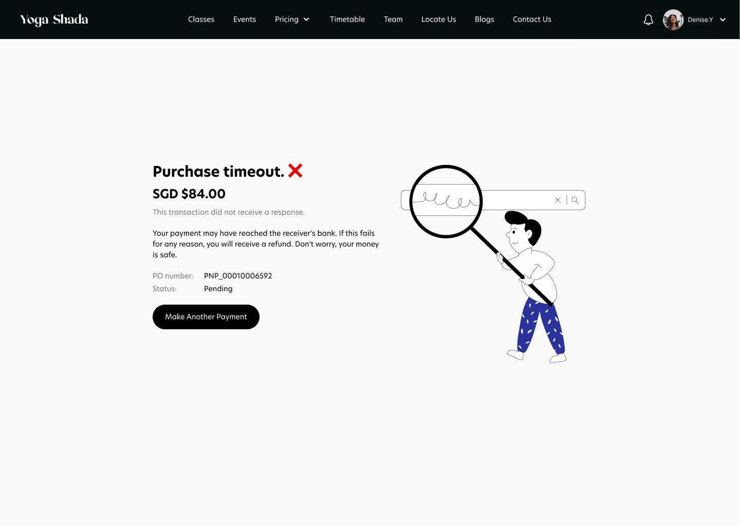
When clicking on "Book Now" CTA on the event details page, users are brought to the Event Ticketing page (as the one you see below). Here, users can add the quantity of tickets they want on which days and make payment through different payment channels which will reflect a payment success state, payment failure state or a purchase timeout state depending on the condition of the purchase.

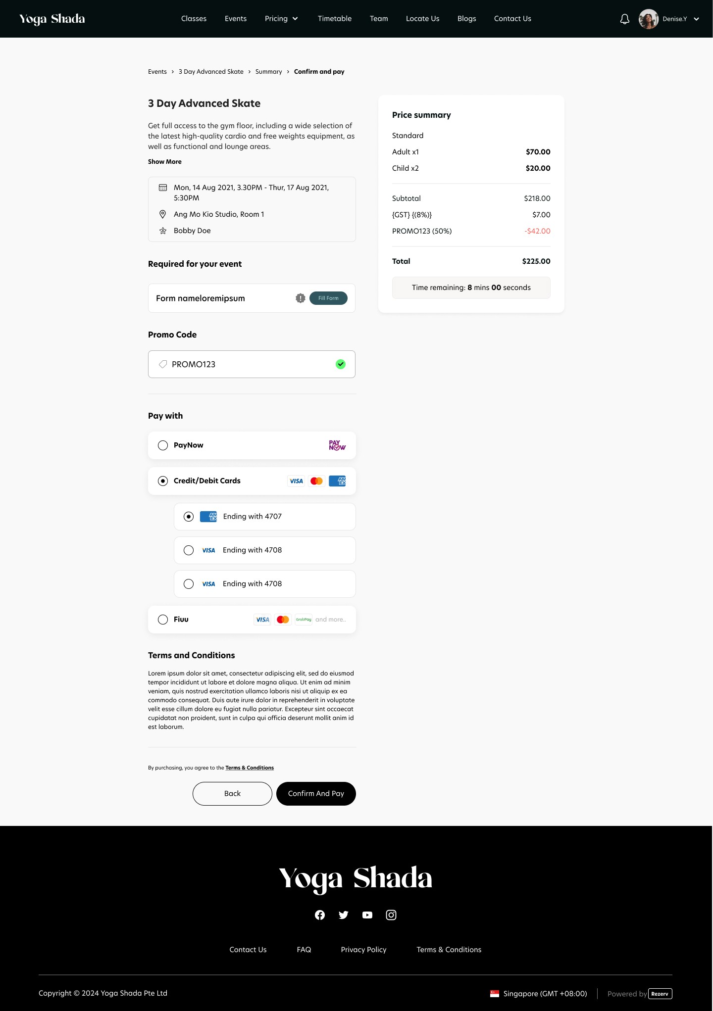
Design for Confirm & Pay
When clicking on "Next" CTA on the ticketing page, users are brought to the Confirm & Pay page (as the one you see below). This would be the case if the event is not free. In the case that the event is free, the CTA will be changed to "Confirm & Pay" on the ticketing page and users will see a purchase success screen when clicking on the CTA.
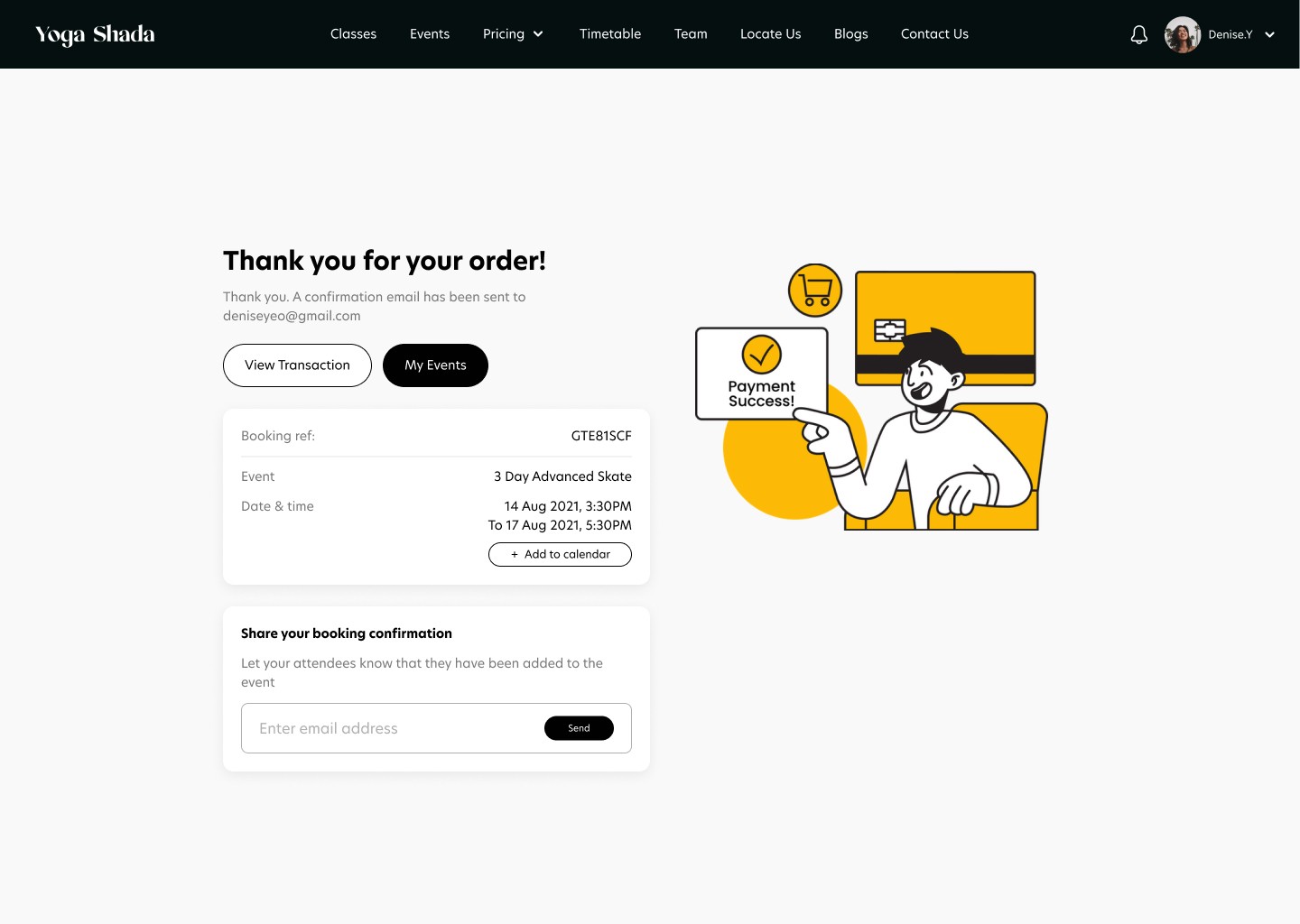
On this page, users can select from multiple payment methods and apply any available discount codes for their event booking. They can also securely add and save their card details, enabling faster and more seamless payments in future bookings. Clicking on "Confirm & Pay" will bring users to a payment success screen if the transaction is successful. Otherwise the screen would show a purchase timeout or payment failed state.
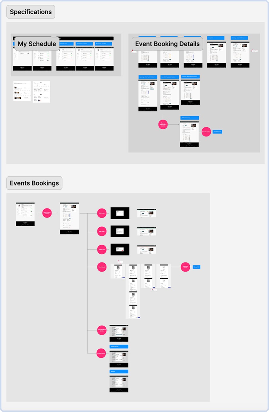
Design for Event Bookings
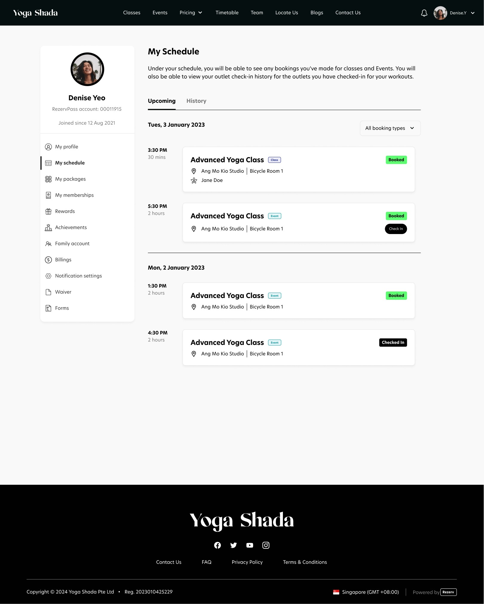
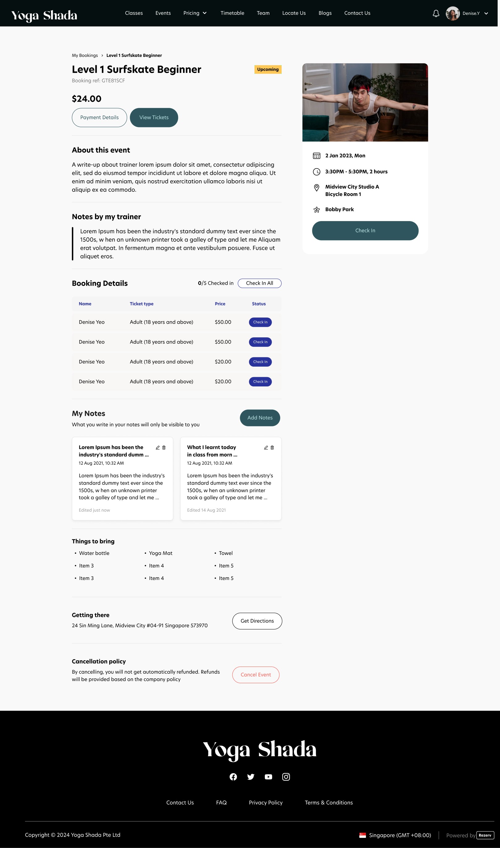
Users are able to view their bookings on their customer portal under their account and click on their event to view important things to bring, view their tickets, check in their attendees (if the business choose to enable this feature) and cancel their registered event/workshop.
Why should clients choose your platform over other platforms like Eventbrite?
What were the limitations and constraints you faced?
How did you work with these constraints faced?
How did you handle reiteration based on feedbacks by clients?
What were some of the feedbacks clients gave?
What were the failures you faced & how did you manage them?
What would you have done differently now?